Stop Redesigning And Start Tuning Your Site Instead
In my nearly two decades as an information architect, I’ve seen my clients flush away millions upon millions of dollars on worthless, pointless, “fix it once and for all” website redesigns. All types of organizations are guilty: large government agencies, Fortune 500s, not-for-profits and (especially) institutions of higher education.
Worst of all, these offending organizations are prone to repeating the redesign process every few years like spendthrift amnesiacs. Remember what Einstein said about insanity? (It’s this, if you don’t know.) It’s as if they enjoy the sensation of failing spectacularly, publicly and expensively. Sadly, redesigns rarely solve actual problems faced by end users.
Further Reading on SmashingMag:
- Clear Indications That It’s Time To Redesign
- Redesigning With Personality
- Redesign: When To Relaunch The Site and Best Practices
- Improving Smashing Magazine’s Performance: A Case Study
I’m frustrated because it really doesn’t have to be this way. Let’s look at why redesigns happen, and some straightforward and inexpensive ways we might avoid them.
The Diagnostic Void
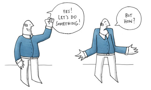
Your users complain about your website’s confounding navigation, stale content, poor usability and other user experience failures. You bring up their gripes with the website’s owners. They listen and decide to take action. Their hearts are in the right place. But the wheels quickly come off.
Most website owners don’t know how to diagnose the problems of a large complex website. It’s just not something they were ever taught to do. So, they’re put in the unfortunate, uncomfortable position of operating like country doctors who’ve suddenly been tasked to save their patients from a virulent new pandemic. It is their responsibility, but they’re simply unprepared.
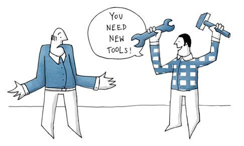
Sadly, many website owners fill this diagnostic void — or, more typically, allow it to be filled — with whatever solution sounds best. Naturally, many less-than-ethical vendors are glad to dress up their offerings as solutions to anyone with a problem — and a budget. The tools themselves (search engines, CMS’, social apps) are wonderful, but they’re still just tools — very expensive ones, at that — and not solutions to the very specific problems that an organization faces. Without proper diagnostics to guide the configuration of tools, any resulting improvements to the user experience will be almost accidental.
Sometimes design agencies are brought in to fill the diagnostic void. And while not all agencies are evil, a great many follow a business model that depends on getting their teams to bill as many hours as they can and as soon as possible. Diagnostics can slow the work down (which is why clients rarely include a diagnostic phase in their RFPs). So, many agencies move to make a quick, tangible impression (and make their clients happy) by delivering redesigns that are mostly cosmetic.
A pretty face can last only a few years, but by then the agency is long gone. Invariably, the new owner wishes to make their mark by freshening or updating the website’s look. And another agency will be more than happy to oblige. Repeat ad nauseam, and then some.
Oh, and sometimes these redesigns can be pricey. Like $18 million pricey.
See why I’m so grouchy?
Forget the Long Tail: The Short Head Is Where It’s At
Whether you’re a designer, researcher or website owner, I’ve got some good news for you: diagnostics aren’t necessarily difficult or expensive. Better yet, you’ll often find that addressing the problems you’ve diagnosed isn’t that hard.
And the best news? Small simple fixes can accomplish far more than expensive redesigns. The reason? People just care about some stuff more than they care about other stuff. A lot more. Check this out and you’ll see:
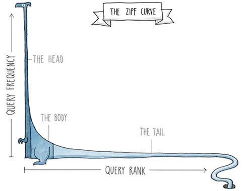
This hockey-stick-shaped curve is called a Zipf curve. (It comes from linguistics: Zipf was a linguist who liked to count words… but don’t worry about that.) Here it is in dragon form, displaying the frequency of search queries on a website. The most frequently searched queries (starting on the left) are very, very frequent. They make up the “short head.” As you move to the right (to the esoteric one-off queries in the “long tail”), query frequency drops off. A lot. And it’s a really long tail.

This is absolutely the most important thing in the universe. So, to make sure it’s absolutely clear, let’s make the same point using text:
| Query’s rank | Cumulative % | Query’s frequency | Query |
|---|---|---|---|
| 1 | 1.40% | 7,218 | campus map |
| 14 | 10.53% | 2,464 | housing |
| 42 | 20.18% | 1,351 | web enroll |
| 98 | 30.01% | 650 | computer center |
| 221 | 40.05% | 295 | msu union |
| 500 | 50.02% | 124 | hotels |
| 7,877 | 80.00% | 7 | department of surgery |
In this case, tens of thousands of unique queries are being searched for on this university website, but the first one accounts for 1.4% of all search traffic. That’s massive, considering that it’s just one query out of tens of thousands. How many short-head queries would it take to get to 10% of all search traffic? Only 14 — out of tens of thousands. The 42 most frequent queries cover over 20% of the website’s entire search traffic. About a hundred gets us to 30%. And so on.
It’s Zipf’s World; We Just Live in It
This is very good news.
Want to improve your website’s search performance? Don’t rip out the search engine and buy a new one! Start by testing and improving the performance of the 100 most frequent queries. Or, if you don’t have the time, just the top 50. Or 10. Or 1 — test out “campus map” by actually searching for it. Does something useful and relevant come up? No? Why not? Is the content missing or mistitled or mistagged or jargony or broken? Is there some other problem? That, folks, is diagnostics. And when you do that with your website’s short head, your diagnostic efforts will go a very long way.
The news gets better: Zipf is a rule. The search queries for all websites follow a Zipf distribution.
And the news gets even jump-up-and-down-and-scream-your-head-off better: Zipf is true not only for your website’s search queries. Your content works the same way! A small subset of your website’s content does the heavy lifting. Much of the rest has little or no practical value at all. (In fact, I’ve heard a rumor that 90% of Microsoft.com’s content has never, ever been accessed. Not once. But it’s a just a rumor. And you didn’t hear it here.) Bottom line: don’t redesign all of your content — focus on the stuff that people actually need.
You’ll also see a short head when it comes to your website’s features. People need just a few of them; the rest are gravy.
And there’s more. Of all the audience types that your website serves, one or two matter far more than the others. What tasks do those audience types wish to accomplish on your website? A few are short-head tasks; the rest just aren’t that important.
As you can see, the Zipf curve is everywhere. And fortunately, the phenomenon is helpful: you can use it to prioritize your efforts to tweak and tune your website’s content, functionality, searchability, navigation and overall performance.

Your Website Is Not A Democracy
When you examine the short head — of your documents, your users’ tasks, their search behavior and so forth — you’ll know where to find the most important problems to solve. In effect, you can stop boiling the ocean…

… and start prioritizing your efforts to diagnose and truly solve your website’s problems.
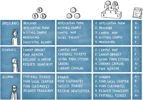
Now, let’s put these short-head ideas together. Below is a report card for an academic website that starts with the short head of its audience:
In other words, of all the audience types this university website has, the three most important are people who might pay money to the university (applicants,) people who are paying money now (students) and people who will hopefully pay money for the rest of their lives (alumni). How do we know they’re the most important audiences? We could go by user research; for example, the analytics might suggest that these audiences generate more traffic than anyone else. Or perhaps the university’s stakeholders believe that these are the most important ones in their influence and revenue. Or some combination of both. Whatever the case, these three audiences likely swamp all other segments in importance.
Then, we would want to know the short-head tasks and information needs of each audience type. We might interview stakeholders to see what they think (column 2). And we might perform research — user interviews and search analytics, for example — to find out what users say is most important to them (column 3).
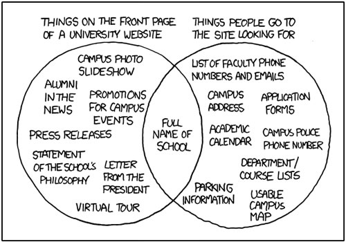
Of course, as the good folks at xkcd demonstrate, stakeholders and users don’t always see things the same way:
That’s why talking to both stakeholders and users is important. And once you’ve figured out the short head for each, you’ll need to earn your salary and, through some careful negotiation, combine your takes on each audience type’s needs. That’s what we’ve done in column 4.
Finally, in column 5, we’ve tested each task or need and evaluated how well it works. (Because it’s a university-related example, letter grades seemed appropriate.) You can do this evaluation in an expensive, statistically significant way; but really, enough research is out there to suggest that you don’t need to spend a lot of time and money on such testing. More importantly, these needs and tasks are often fairly narrow and, therefore, easy to test.
So, after testing, we can see what’s not going well. Finding information on “mentoring” is hard for applicants. And current students have a devil of a time when they “look up grades.”
Now we’re done diagnosing the problems and can begin making fixes. We can change the title of the “Paired Guidance Program” page to “Mentoring.” We can create a better landing page for the transcript application. The hard part, diagnostics, is out of the way, and we can now fix and tune our website’s performance as much as our resources allow.

From Project To Process To Payoff
These fixes are typically and wonderfully small and concrete, but because they live in the short head, they make a huge and lovely impact on the user experience — at a fraction of the cost of a typical redesign.
The tuning process itself is quite simple. It’s what we used to arrive at the report card below:
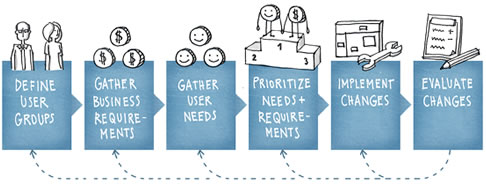
If you repeat this simple process on a regular basis — say, every month or quarter — then you can head off the entropy that causes fresh designs and fresher content to go rotten. Thus, the redesign that your organization has scheduled for two years from now can officially be canceled.
Your website’s owners ought to be happy about all this. And you should be, too: rather than tackling the project of getting your website “right” — which is impossible — you can now focus on tweaking and tuning it from here on out. So, forget redesigns, and start owning and benefiting from a process of continual improvement.

Special Thanks - Illustrations
Eva-Lotta is a UX Designer and Illustrator based in London, UK where she currently works as an interaction designer at Google. Besides her daytime mission of making the web a more understandable, usable and delightful place, she regularly takes sketchnotes at all sorts of talks and conferences and recently self-published her second book. Eva-Lotta also teaches sketching workshops and is interested in (something she calls) visual improvisation. Exploring the parallels between sketching and improvisation, she experiments with the principles from her theater improvisation practice to inspire visual work.


 Register Free Now


 Try ProtoPie AI free →
 Celebrating 10 million developers