Designing For The Multifaceted User
Designing with users in mind is a tricky thing. Not only does it require of us a sound understanding of who our users are, but the actual act of translating what we know about them into a well-designed product is not always an obvious or easy path.
Currently, our user experience tools tend to focus on “who” users are. I believe this is a hangover from how we traditionally approached marketing and market research. A couple of years ago, I stumbled across a somewhat different method, which has proven useful in a few of my own projects. It has been particularly handy for building value propositions and for clarifying assumptions we make about our users’ behaviours. Most of all, I like how it helps with prioritizing product design decisions.
So, first, let me explain where I think our current toolset falls short, and then I’ll walk you through an example that uses this newer technique. By the end of this article, you should be ready to give it a try yourself.
We Are Multifaceted
Put yourself in the shoes of a user for a moment. Imagine that a friend has introduced you to a new Facebook group about a subject you both like. If you are the shy sort, like me, you would lurk around for a little while. Once you became more familiar with the group’s dynamics, you might gradually become bold enough to post a comment or share an appropriate link.
Imagine also, then, that you’ve stumbled upon a blog post on a topic that you care strongly about. Someone has posted a comment that you completely disagree with — I’ll wager that, if you’re fired up, you would post almost immediately, rather than take the time to absorb previous posts. You remain the same person, yet your reaction to something will depend on what it is and what is happening at the time. This is normal.
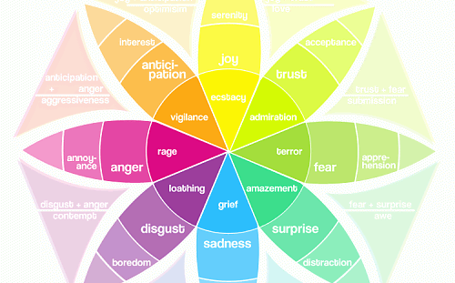
Acting differently according to circumstance and context is natural. Image source.
What does this mean for us as designers? For me, it means that our deliverables right now are probably too prescriptive in their details about who the user is. We would probably do better to work towards a clearer understanding of the user’s varying contexts — contexts that would yield different behaviors and decisions.
In short, our current tools tend to focus on the person, not on predicting their reactions and, therefore, what we should effectively be designing for.
Personas, User Journeys, Mental Models?
Personas, when created properly based on research, distill what we know about a few key user profiles. They have many advantages, particularly in enabling a common language among stakeholders about who our users are. User journeys and experience maps show a potential path that a user can take through an application or website. They are great for understanding flows and for mapping user needs to functionality.
However, both of these tools, and others similarly derived, take on a depth-wise view of the user. User journeys can map out specifically what a user may do, too, but not take into account why they make certain decisions. With personas, you garner some degree of knowledge about users’ background contexts and activities, but they might contain more detail about particular user profiles than what you need to design app-wide features.
Consider what is actually involved in your typical design process. At any stage, your design needs to cater to different activity flows. As designers, we often have to collapse a complex range of user behaviors into quantifiable feature sets that could feasibly fit a product management schedule.
Between personas and user journeys, it would get unwieldy to explore and map these complex ranges of behavior in a way that wouldn’t give us a headache. The closest tool we have at our disposal is the mental model, with which you map out a user’s intentions and tasks. However, a generic use of mental models doesn’t always take different contexts into account at a glance.
The question remains, how can we better position a product or design an interface that maps onto users’ decision patterns when their behaviors and motivations span a spectrum?
Modelling User Groups
I finally found a semblance of the method I’d been looking for while gate-crashing a guest lecture by a friend and colleague, David Rollert, a designer with extensive experience.
Holding a roomful of smart design-engineering students at his attention, David showcased a number of user experience tools that day, including a way to model groups of users. Using a dating website as an example, he explained how we can define key “dimensions” of customer groups (figures 1 and 2 below). This first step is not dissimilar to what we often already do when creating personas. The following diagrams are quoted from David’s slide deck, with his blessing.
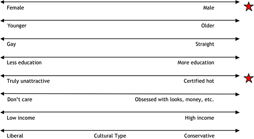
Figure 1. Demographic dimensions for a dating service.
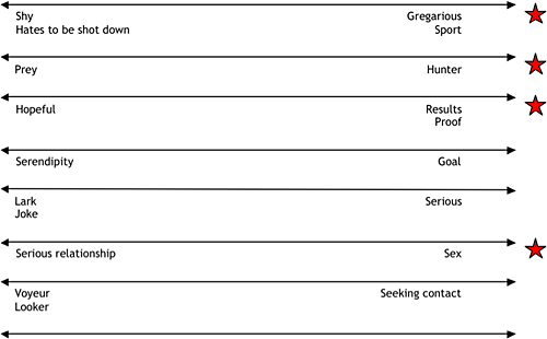
Figure 2. Psychographic dimensions for a dating service.
This next step is where we start to look for patterns. Then, picking two of these dimensions, he showed an example of a 3 × 3 matrix where you could map someone’s immediate goal relative to the role they preferred to play (figure 3). In order to fill in the matrix, David asked the question, “What does each group need?”
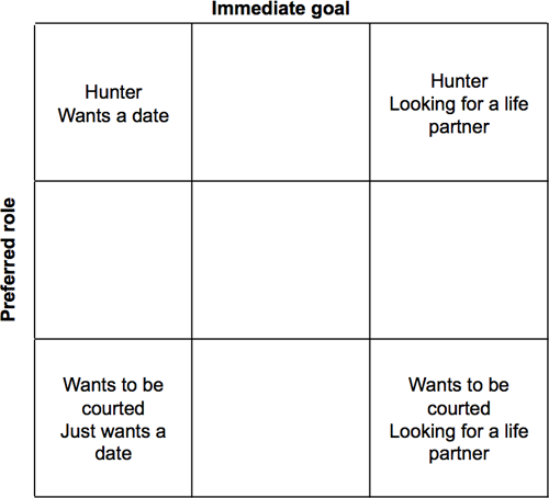
Figure 3. Mapping target customers: What does each group need?
A similar technique of user modelling is mentioned in A Project Guide to UX Design by Russ Unger and Carolyn Chandler (chapter 6, page 90), but it barely spans a page. While emphasizing the need for real user research, this reference still aligns with what we’ve always done — grouping users according to who they are, rather than what the users want to do or what drives them.
I thought it was fascinating. Rather than asking the question of “who” these customer groups are, what if we were to ask different questions? Such as, “What do these groups of users want to do?” or “What do they need to know?” Over my next few projects, I started incorporating this technique into my own work with clients, and it has turned out to be a useful tool on many occasions.
Before getting much further, I want to point out that this method is not a deliverable. It is not something you just draw up and send over to your client or product manager for sign-off. It is a technique that is most effectively used in a workshop format with all stakeholders in the same room.
Exploring Our Assumptions About Users
“User” has become such a loaded word. We pile all our beliefs, interpretations and emotional baggage onto the word “user” and on what they would want. Having been on many teams, I’ve started to realize that it’s a common problem that not all stakeholders and team members understand the word “user” in the same way. This is why having a set of personas internally can help iron out the issue of language.
However, the problem with personas is that they place a particular user on a map discretely, but they are not necessarily the best high-level tool for looking at continuous spectrums of user contexts.
The matrix technique explores what we know and what we don’t know about our users by looking through the lens of contexts for their behaviors and motivations.
I’ve used this method to do the following:
- to establish key audiences;
- to understand or validate value propositions;
- to help prioritize research areas and product features — to identify what we already know and where we lack data;
- to pinpoint which features are vital.
It is essentially a structured brainstorming tool to make sense of user patterns. Best of all, it can be an easy way to unpack assumptions that each stakeholder is making about their users.
Step 1: Draw Your Matrix
In the many times I’ve since done this little thinking process with clients or workshop attendees, a 3 × 3 grid has worked best for me. This is probably because it gives enough variation without being too precise — thereby keeping us from getting analysis-paralysis.
Step 2: Identify Important Axes
The next step is to identify how many of these different “selves” of our users can exist in this system we are designing for.
Let’s talk about the example of a potential social app for runners. It’s a straightforward offering with which local runners can post routes and visiting runners can find routes. We could imagine virtual competitive elements; a runner might have previously posted a time that you are trying to beat on the same route. Or you might just want a scenic run as a way to explore a new city’s environments.
What kinds of behavioural attributes can we come up with for runners who would likely use this app? I tend to think in terms of “opposing” attributes. You might end up with a list looking like this and the corresponding user stories:
- explorative. “I want a new way to experience this city through running.”
- competitive. “I like to race against someone else, or against myself.”
- frequent. “I run a lot, several times a week to every day.”
- occasional. “I run once a week or less.”
Your axes might then look like this:
| curious | ↔ | engaged |
| social | ↔ | individual |
| explorative | ↔ | competitive |
| frequent | ↔ | occasional |
| visitor | ↔ | local |
Depending on the project you are working on, you may or may not know something about the users you are talking about. The team with which we explored the idea of this social app belonged to a sports shoe company and consisted entirely of runners who travel fairly frequently to run marathons. They had also done studies previously and gotten some ideas of the spectrum of novice runners to advanced runners, and some insight into the kinds of people who use an existing Web app that they produced.
As you go through this exercise, keep in mind what you know about your users and what you are presuming. From the list above, choose two axes that most interest you or that you think are worth exploring. Choosing might be difficult if you are just starting with this method; in which case, the best thing to do is to dive in and see what happens. If it doesn’t work or if ideas don’t seem to flow, change your axes and keep going.
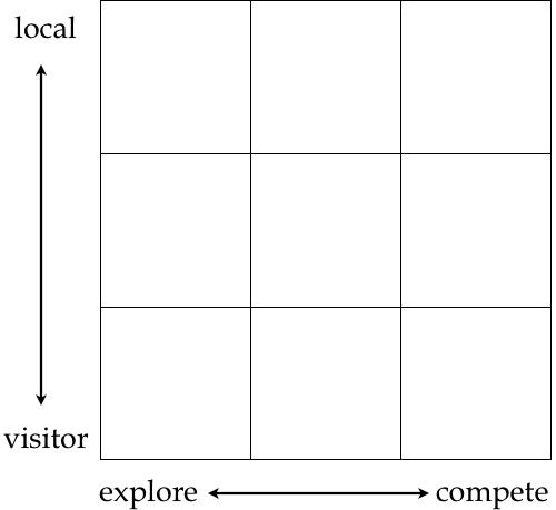
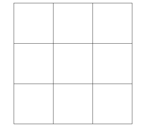
Figure 5. A blank matrix with a pair of key axes.
Step 3: Identify Key Questions
I liken this step to a “magic 8 ball” process. Ask a question! I generally like, “What would these users want to do?” Or, even more simply, “What do they want?” The latter question would cover what users want to know and what they would want to do. You could also ask questions like, “How would they feel?” as a kind of emphatic exercise.
As you think up questions, keep a list handy. You’ll need it later.
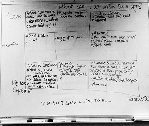
In this example, let’s stick with “What can they do?” Or, from a user’s perspective, “What can I do with this app?”
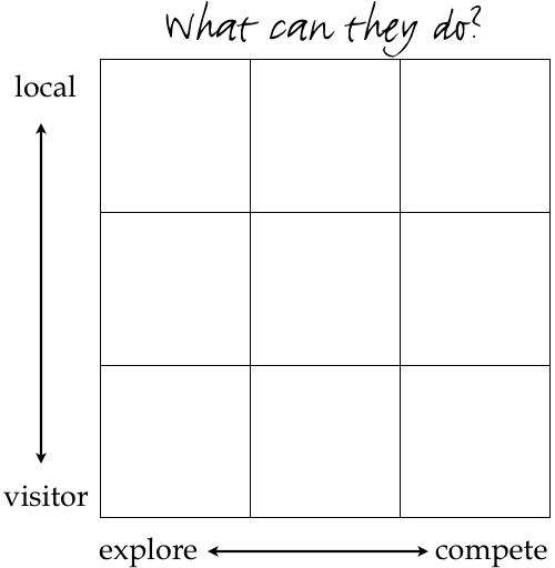
Figure 6. A blank matrix with axes and a question.
Step 4: Fill It Up
Fill in the matrix as best you can. If you already have some insights from research, then mark which things you know for certain, as opposed to things you believe to be true but have nothing yet to back it up.
Generally, by the time you’ve filled the first matrix, you’ll have a fairly good idea of what information you already know about your users and what further research might be required.
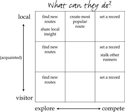
Figure 7. Filling in a matrix.
Step 5: Iterate
Once you are done with the first matrix, set that aside, and draw another blank grid.
You can do one of two things:
- Pick another question from your list, “What do these users need from us?”; or
- Switch one of your axes to something different, but stick to the same question.
Start filling in the matrix again from the top. Remember, this is a brainstorming process. Putting down ideas that you can refine later is more important, so try to move rapidly through each iteration.
When you have done as much as you can with this iteration of the matrix, do the dance again: pick another question, or switch another axis.
It’s best when your team collectively chooses which questions and spectrums to think about.
Rinse and repeat. You’ll likely find that you can generate a lot of matrices in the space of just an hour, even if it may be a slow start at first.
Analysis And Key Insights
Once you have done a few of these, it is time to sit back and look for patterns. Let’s look at a few things that could emerge.
Assumptions vs. Knowledge
One important thing to remember — I cannot emphasize this enough — is when you and your team sit down and write this all out, what you have is merely a summary of a complex set of assumptions. As you manage your discussions around any insights, keep in mind that you are discussing various degrees of potential truth. This is an handy tactic to avoid getting into fights about too much detail!
With your matrices in hand, now is a very good time to see which set of users we already know about, and how confident we are in stating their needs. Obviously, it is also a very good time to identify which users we know nothing about. Have we already done any research on any of these user groups? Do we have any case studies that back up any of the answers we have listed in the matrices? In short, what do we know, and what don’t we know?
If we don’t have any evidence at hand to back up some of these user needs we have written down, then these are merely assumptions that we need to test. Assumptions are great because they serve as perfect design hypotheses. With this set of matrices, we can now identify what kind of user research we need to undertake to validate our assumptions.
Common Factors
Quite often you’ll notice that some questions generate similar results all the way down one column or one row. For example, in figure 7, we assumed that all “exploring” users would likely be interested in finding new routes regardless of whether they are locals or visitors and, similarly, that all “competitive” users would likely be interested in time-keeping.
Nothing is wrong with this; it just means that when we come to test for these needs, we will have some parameters to decide what kind of users we need to talk to. And when we come to design for these scenarios, these features will likely represent the “baseline” functionality to include in our app.
Priority And Dependencies
Sometimes, when you are trying to prioritize features, the practice of generating these user matrices can help you unpack some clear dependencies. In the case of our app, it became clear very quickly that the type of users who would populate the routes in a meaningful way would be locals — before being used by visitors. This means we needed to make the app attractive to local runners first, from all standpoints: in our feature set, in our communications and in our marketing.
Core Value Proposition
“Value proposition” is just a fancy way of describing the promise of the value you will be providing to customers. When you work through a set of matrices, you might find that you have a clearer view of what you are really promising users by addressing the ranges of users’ needs and contexts.
As for our little example, we had done a handful of matrices in less than an hour. Suddenly, one of the team members shouted excitedly, “‘I wish I knew where to run!’ That is the question we need to answer!”
I handed her the pen, and she scribbled the figure below (8) at the bottom of our last matrix. We knew then that, for this app to succeed, we would have to be able to answer this question, no matter what the user’s context — and that would be our core value proposition at its rawest. With this, we now had an excellent focus on the reasoning behind the design, and we’d just given ourselves a clear fundamental principle through some bottom-up thinking.
Taking It Further
So, we have a set of matrices on our hands and some high-level analysis and insight. What next?
First, as with many workshop tools that encourage structured brainstorming, the process is as important as the result itself, possibly more so. As I stated in the beginning, this process doesn’t generate a pretty formatted deliverable — rather, it clarifies how we really think about our users.
Having gone through the process of generating these matrices and analyzing them, you should find that you can take on subsequent challenges with more clarity:
- Decide which user groups require more research, from which you can generate personas, mental models and user journeys for more detailed tasks, if required.
- Establish a product road map based on having identified which needs should be met across user groups, so that you can decide which features to design and build together.
One happy little byproduct of expressing user needs through such matrices is that you can delineate each of them into a corresponding user story, which fits nicely into an agile methodology. Using our app again as an example, we can create a user story like, “As a local runner, I want to find new routes to run.” You could then decide whether that user story is a validated user need; if so, you could transfer it into a design-then-build process.
When Does It Work Best?
I’ve successfully used this method in conjunction with others when I help startups figure out how to approach their user base, and also what they ought to build first. It fits neatly into methodologies such as the Lean Startup because it creates a structured basis for generating hypotheses. I’ve found it to be excellent both as a preliminary thinking tool to facilitate design decisions and as a synthesizing tool in the process of user research.
No doubt, as you explore this method, you may find other ways it works for you, or not at all. You could say that there is the right tool for every job, but sometimes the best tool is the one that gets the job done in the simplest and quickest way.
In this case, we have a very simple way to enable us to think about the ranges of user behaviors and motivations — while keeping their contexts in mind.
Other Resources
- Mental Models: Aligning Design Strategy With Human Behavior, Indy Young
- A Project Guide to UX Design, Russ Unger and Carolyn Chandler
- “User Stories: A Strategic Design Tool,” Penny Hagen and Michelle Gilmore
- User Stories Applied for Agile Software Development, Mike Cohn
- The Lean Startup, Eric Ries
Acknowledgements
Many thanks to David Rollert, who sparked the idea for the approach described in this article, and who I hold wholly responsible for opening my eyes to better ways to achieve great user experiences.
Further Reading
- Better User Experience With Storytelling
- A Closer Look At Personas
- How To Sell Your UX Design Solution To Clients
- Stop Redesigning And Start Tuning Your Site Instead


 SurveyJS: White-Label Survey Solution for Your JS App


 Celebrating 10 million developers
 Register Free Now