Developer Decisions For Building Flexible Components
In the real world, content often differs vastly from the neat, perfectly fitting content presented in designs. Added to that, on the modern web, users have an ever-increasing range of options for how they access the sites we build.
In this article, we’ll walk through the process of taking a seemingly simple design for a text-and-media component and deciding how best to translate it into code, keeping in mind the needs of both users and content authors. We’re not going to delve into how to code it — rather, the factors that will determine our development decisions. We’ll consider the questions we need to ask (both ourselves and other stakeholders) at every step.
Changing Our Development Mindset
We simply can no longer design and develop only for “optimal” content or browsing conditions. Instead, we must embrace the inherent flexibility and unpredictability of the web, and build resilient components. Static mockups cannot cater to every scenario, so many design decisions fall to developers at build time. Like it or not, if you’re a UI developer, you are a designer — even if you don’t consider yourself one!
In my job at WordPress specialist web agency Atomic Smash, we build websites for clients who need maximum flexibility from the components we provide, while ensuring the site still looks great, no matter what content they throw at it. Sometimes interpreting a design means asking the designer to further elaborate on their ideas (or even re-evaluate them). Other times, it means making design decisions on the fly or making recommendations based on our knowledge and experience. We’ll look at some of the times these approaches might be appropriate in this case study.
The Design
We start with a simple design for a text-and-media component — something fairly commonly seen on product landing pages. It consists of an image or video on the left and a column on the right containing a heading, a paragraph of text and a call-to-action link. This design is for a (fictional) startup that helps people who want to learn a new skill find a tutor.

Note: If you want to jump straight to the code and view all the possible solutions we alighted on for this component, you can find it in this Codepen demo.
Layout And Order
The designer has stipulated that every other component should have the layout flipped so that the image is on the right and the text column on the left.
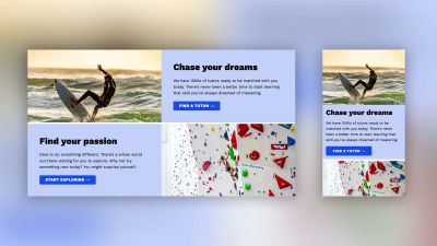
In the mobile layout, however, the image is stacked above the text content in all cases. Assuming we build this layout using either Grid or flexbox, we could use flex-direction or the order property to reorder the layout for every second component:
.text-and-media:nth-child(even) {
    flex-direction: row-reverse;
}
It’s worth bearing in mind that while these will reorder the content visually, it does not change the DOM order. This means that to a partially-sighted person browsing the site using a screenreader, the order of the content may not appear logical, jumping from left-to-right to right-to-left.
Speaking personally, in the case where the only content in one of the columns is an image, I feel that using the order property is more or less okay. But if we had two columns of text, for instance, reordering with CSS might make for a confusing experience. In those cases, we have some other options available to us. We could:
- Put forward our accessibility concerns and recommend that for mobile layouts the visual order is changed to match the desktop order.
- Use Javascript to reorder the elements in the DOM.
We also need to consider whether to enforce the order through the :nth-child selector or to allow the client to control the order (by adding a class to the component, say). The suitability of each option will likely depend on the project.
Dealing With Different Content Lengths
In the design, the proportion of text content compared to the image is quite pleasing. It allows the image to maintain an ideal aspect ratio. But what should happen if the text is longer or shorter than what’s presented? Let’s deal with the former first.
Longer Content
We can set a character limit on the text field in our chosen CMS (if we’re so inclined), but we should allow for at least some variation in our component. If we add a longer paragraph, the opposing media column could behave in one of several ways:
- The image or video remains at the top, while space is added below (fig. 1).
- The image or video is centered, adding space at the top or bottom (fig. 2).
- The proportions of the image or video are scaled to match the height, using
object-fit: coverto prevent distortion and ensure the image fills the available space. This would mean some parts of the image may be clipped (fig. 3).



We decided that option 3 was the most pleasing visually, and that for the most part content authors would be able to source appropriate images where a small amount of clipping would be acceptable. But it presented more of a challenge for video content, where there is more of a risk that important parts could be clipped. We alighted on another option, which was to create a different variation of the design where the video would maintain its original aspect ratio, and be contained within a maximum width instead of aligning to the edge of the page.

Content authors could choose this option when it better suited their needs.
Additionally, we opted to extend this choice to instances where an image was used instead of a video. It gives the client a wider variety of layout options without adversely impacting the design. Seen in the wider page context it could even be considered an improvement, allowing for more interesting pages when several of these blocks are used on a page.
Shorter Content
Dealing with less content is a little simpler, but still presents us with some issues. How should the image behave when the text content is shorter? Should it become shallower, so that the overall height of the component is determined by the text content (fig. 4)? Or should we set a minimum aspect ratio, so that the image doesn’t become letterboxed, or allow the image to take up its natural, intrinsic height? In that case, we also have the consideration of whether to align the text centrally or to the top (fig. 5 and 5a).


Heading Length
Let’s not forget we’ll also need to test headings of different lengths. In the design the headings are short and snappy, rarely wrapping onto a second line. But what if a heading is several lines long, or the content uses a lot of long words, resulting in text wrapping differently? This might especially be a problem in languages such as German, where words tend to be much longer than English, for example. Does the size of the heading font in the design allow for an appropriate line length when used in this layout? Should long words be hyphenated when they wrap? This article by Ahmad Shadeed addresses the issue of content length and included some handy tips for ways to deal with it in CSS.
Are content authors permitted to omit a heading altogether where it suits them? That brings us to the next consideration.
Omitting Content
Building this component as flexibly as possible means making sure that content authors can omit certain fields and still have the design look and function properly. It seems reasonable that the client may wish to omit the body text, the link, or even the heading when using this component in the wild. We need to take care to test with every conceivable combination of content, so that we can be confident our component won’t break under stress. It’s good practice to ensure we’re not rendering empty HTML tags when field content isn’t present. This will help us avoid unforeseen layout bugs.
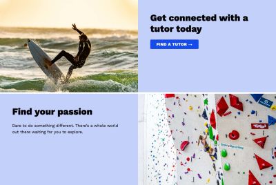
We can restrict content authors with “required” fields in the CMS, but perhaps we might also wish to consider scenarios where a client might choose to omit the image, or, conversely, without any of the text content? It might be helpful to provide them with these options. Here’s an example of how we might elect to render the component in those cases:

By indenting the text a little more and increasing the width of the body text, we can keep it feeling balanced, even when there is no image.
Multiple Links
Omitting content is one scenario. But at Atomic Smash, we found that more often, clients wanted the option to add more than one link to the component. That presents us with another choice: how to layout multiple links? Do we lay them out side-by-side (fig. 8), or stack them vertically (fig. 8a)?


How do we deal with link titles of wildly different lengths? A nice trick is to set the widths of both links to the maximum width of the longest (fig. 9). (This article covers just that.) That works well for vertically stacked buttons, whereas laying them out horizontally presents us with even more choices (fig. 9a).


Do we need a secondary link style, to differentiate them? These are all questions to consider.

We may also need to consider (in the case of a single link) whether, in fact, the clickable area of the link should encompass the entire component — so users can click anywhere on it to activate the link. That choice might perhaps depend on the wider context. It’s certainly common in card-based UIs.
Video
When the component is used for video rather than a static image, we might notice that the design omits some key information. How is the video playback controlled? On hover? Does it autoplay on scroll? Should there be controls visible to the user?
If the video plays on hover, we must consider how the user of a device without hover capabilities accesses the video content. Alternatively, if the video autoplays, we should consider preventing this for users with a preference for reduced motion, who may suffer from vestibular disorders (or might simply wish to avoid jarring animations). We should also provide a way for all users to stop the video when they wish.
Putting It In Context
One issue with focusing so closely on components when it comes to web design, is sometimes we forget to consider how the components we build will appear in the context of the overall web page. We’ll need to consider the spacing, both between components of the same type and in a page layout where other components are interspersed.
These text-and-media components are designed to be used sparingly, creating an eye-catching splash of color and a break from an otherwise linear layout. But using WordPress, a content author could easily decide to build an entire page made up of nothing but these components. That could end up looking rather dull, and not at all the effect we were hoping for!
During the build process, we decided to add an option to omit the background color. That allows us to break the page up and make it more interesting:
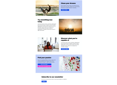
We could either enforce a pattern using :nth-child or add a field in the CMS to give the client more creative control.
Although this was not part of the original design, it shows that an open line of communication between designer and developer can help create better outcomes in terms of more flexible and robust designs.
WYSIWYG Text Styles
When considering content, we need to consider not just the length of text, but the actual HTML elements that might be permitted in the body text field. Content authors might want to add multiple paragraphs, anchor links, lists, and more to the body copy. At Atomic Smash we like to provide a WYSIWYG (What You See Is What You Get) or rich text field for these areas, which can allow for many different elements. It’s important to test with different types of content, and style appropriately — including testing for sufficient color contrast on all background colors used.

Wrapping Up
We’ve touched on many different decisions involved with building this seemingly simple component. You might even be able to think of a few others we haven’t covered here! By considering every aspect of the design and how it might be used in context, we’ve ended up with something far more versatile, which hopefully should result in happier clients!
Sometimes, the more that is omitted from a design, the more time and attention will be required from a developer. I’ve put together a checklist below of things to test and question when building a component, which you might find useful. It may be adapted for different components too.
Being able to look past the apparent simplicity, break down a component into its constituent parts, ask key questions (even before any development takes place), and even consider future uses, are all skills that will serve any developer well when building websites — and will help you provide vastly more accurate estimates when required. Good team communication and a strong collaborative process are invaluable for building resilient sites, but the end result makes it worth investing in nurturing this culture. Let’s bake flexibility into our design and build processes.
The Checklist
Things to test:
- Accessibility of layout (mobile and desktop).
- Images of different intrinsic aspect ratios — are they cropped appropriately?
- Longer and shorter body text (including multiple paragraphs).
- Longer and shorter heading (including various word lengths).
- Omitting (variously) the heading, body text, links and image.
- Multiple links (including different lengths of link text).
- Accessibility of video content.
- WYSIWYG text content (include links, lists, etc. in body text).
- Test in context — include multiple components (with different content options), as well as other components mixed into the page layout.
Further Reading
- Developer Decisions For Building Flexible Components
- An Introduction To CSS Scroll-Driven Animations: Scroll And View Progress Timelines
- Three Approaches To Amplify Your Design Projects
- How To Improve Your Microcopy: UX Writing Tips For Non-UX Writers


 SurveyJS: White-Label Survey Solution for Your JS App
 Register Free Now
 Celebrating 10 million developers


