The Psychology Of Color In UX And Digital Products

Email Newsletter
Weekly tips on front-end & UX.
Trusted by 182,000+ folks.
 Celebrating 10 million developers
 SurveyJS: White-Label Survey Solution for Your JS App
 Register Free Now


Color plays a pivotal role in crafting compelling user experiences and successful digital products. It’s far more than just aesthetics; color strategically guides users, establishes brand identity, and evokes specific emotions.
Beyond functionality, color is also a powerful tool for brand recognition and emotional connection. Consistent use of brand colors across a digital product reinforces identity and builds trust. Different hues carry cultural and psychological associations, allowing designers to subtly influence user perception and create the desired mood. A thoughtful and deliberate approach to color in UX design elevates the user experience, strengthens brand presence, and contributes significantly to the overall success and impact of digital products. In this article, we will talk about the importance of color and why they are important for creating emotional connection and delivering consistent and accessible digital products.
Well-chosen color palettes enhance usability by creating visual hierarchies, highlighting interactive elements, and providing crucial feedback on screens. For instance, a bright color might draw attention to a call-to-action button, while consistent color coding can help users navigate complex interfaces intuitively. Color also contributes significantly to accessibility, ensuring that users with visual impairments can still effectively interact with digital products. By carefully considering contrast ratios and providing alternative visual cues, designers can create inclusive experiences that cater to a wider audience.
“
Communicating Brand Identity Through Color In The Digital Space
A thoughtfully curated and vibrant color palette becomes a critical differentiator, allowing a brand to stand out amidst the digital noise and cultivate stronger connections with the audience.
Far beyond mere decoration, color acts as a visual shorthand, instantly conveying a brand’s personality, its underlying values, and its unique essence. According to the American Marketing Association, vibrant colors, in particular, possess an inherent magnetism, drawing the eye and etching themselves into memory within the online environment. They infuse the brand with energy and dynamism, projecting approachability and memorability in a way that more muted tones often cannot.
Consistency: The Core Of Great Design
Consistency is important because it fosters trust and familiarity, allowing users to quickly identify and connect with the brand in the online landscape. The strategic deployment of vibrant colors is especially crucial for brands seeking to establish themselves and flourish within the digital ecosystem. In the absence of physical storefronts or tangible in-person interactions, visual cues become paramount in shaping user perception and building brand recognition. A carefully selected primary color, supported by a complementary and equally energetic secondary palette, can become synonymous with a brand’s digital presence. A consistent application of the right colors across different digital touchpoints — from the logo and website design to the user interface of an app and engaging social media campaigns — creates a cohesive and instantly recognizable visual language.
Several sources and professionals agree that the psychology behind the colors plays a significant role in shaping brand perception. The publication Insights Psychology, for instance, explains how colors can create emotional and behavioural responses. Vibrant colors often evoke strong emotions and associations. A bold, energetic red, for example, might communicate passion and excitement, while a bright, optimistic yellow could convey innovation and cheerfulness. By consciously aligning their color choices with their brand values and target audience preferences, digitally-native brands can create a powerful emotional resonance.
Beyond Aesthetics: How Color Psychologically Impacts User Behavior In Digital
As designers working with digital products, we’ve learned that color is far more than a superficial layer of visual appeal. It’s a potent, often subconscious, force that shapes how users interact with and feel about the digital products we build.
We’re not just painting pixels, we’re conducting a psychological symphony, carefully selecting each hue to evoke specific emotions, guide behavior, and ultimately forge a deeper connection with the user.
The initial allure of a color palette might be purely aesthetic, but its true power lies in its ability to bypass conscious thought and tap directly into our emotional core. Think about the subtle unease that might creep in when encountering a predominantly desaturated interface for a platform promising dynamic content, or the sense of calm that washes over you when a learning application utilizes soft, analogous colors. These are not arbitrary responses; they’re deeply rooted in our evolutionary history and cultural conditioning.
To understand how colors psychologically impact user behavior in digital, we first need to understand how colors are defined. In digital design, colors are precisely defined using the HSB model, which stands for Hue, Saturation, and Brightness. This model provides a more intuitive way for designers to think about and manipulate color compared to other systems like RGB (Red, Green, Blue). Here is a quick breakdown of each component:
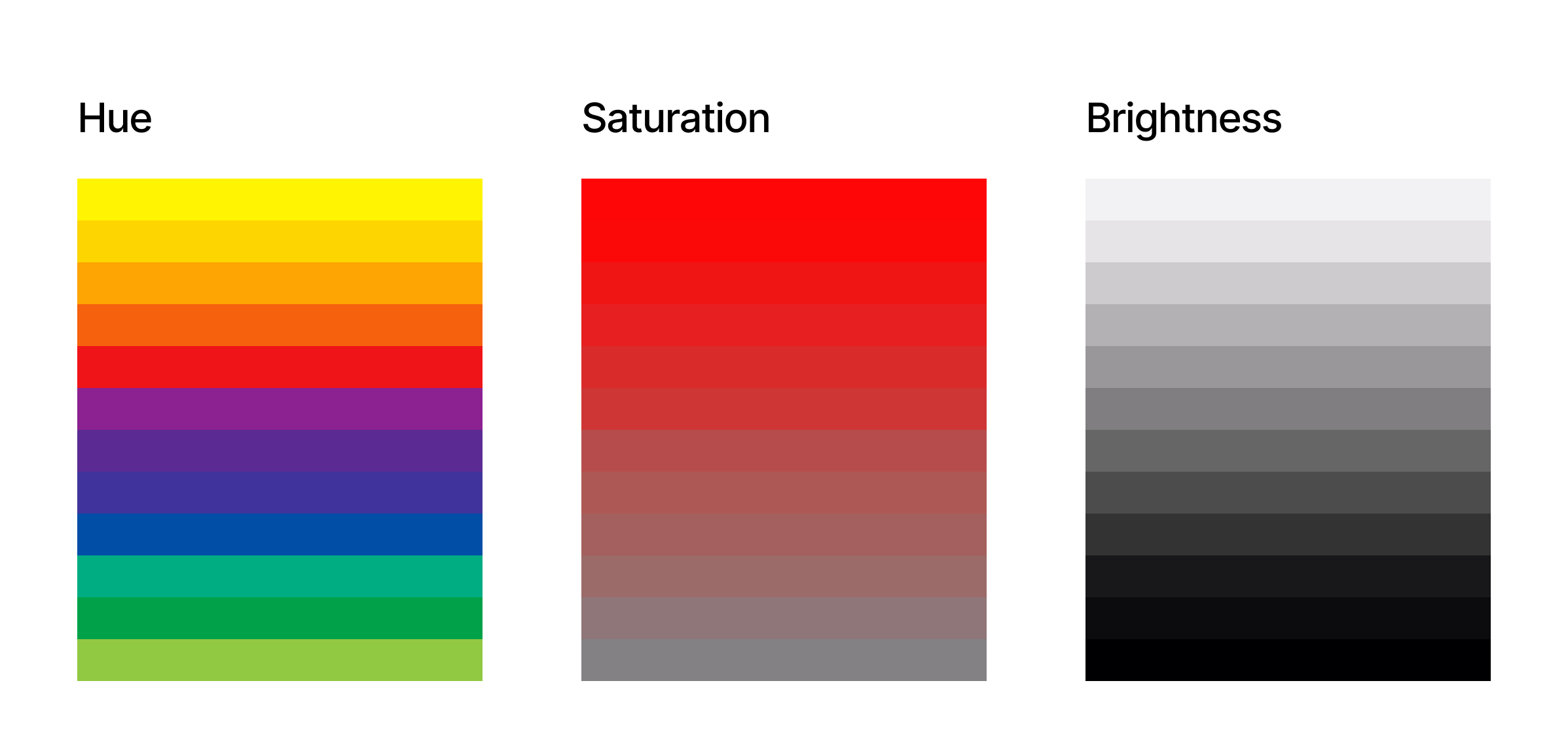
Hue
This is the pure color itself, the essence that we typically name, such as red, blue, green, or yellow. On a color wheel, hue is represented as an angle ranging from 0 to 360 degrees. For example, 0 is red, 120 is green, and 240 is blue. Think of it as the specific wavelength of light that our eyes perceive as a particular color. In UX, selecting the base hues is often tied to brand identity and the overall feeling you want to convey.
Saturation
Saturation refers to the intensity or purity of the hue. It describes how vivid or dull the color appears. A fully saturated color is rich and vibrant, while a color with low saturation appears muted, grayish, or desaturated. Saturation is typically expressed as a percentage, from 0% (completely desaturated, appearing as a shade of gray) to 100% (fully saturated, the purest form of the hue).
In UX, saturation levels are crucial for creating visual hierarchy and drawing attention to key elements. Highly saturated colors often indicate interactive elements or important information, while lower saturation can be used for backgrounds or less critical content.
Brightness
Brightness, sometimes also referred to as a value or lightness, indicates how light or dark a color appears. It’s the amount of white or black mixed into the hue. Brightness is also usually represented as a percentage, ranging from 0% (completely black, regardless of the hue or saturation) to 100% (fully bright). At 100% brightness and 0% saturation, you get white. In UX, adjusting brightness is essential for creating contrast and ensuring readability. Sufficient brightness contrast between text and background is a fundamental accessibility requirement. Furthermore, variations in brightness within a color palette can create visual depth and subtle distinctions between UI elements.
By understanding and manipulating these 3 color dimensions, digital designers have precise control over their color choices. This allows for the creation of harmonious and effective color palettes that not only align with brand guidelines but also strategically influence user behavior.
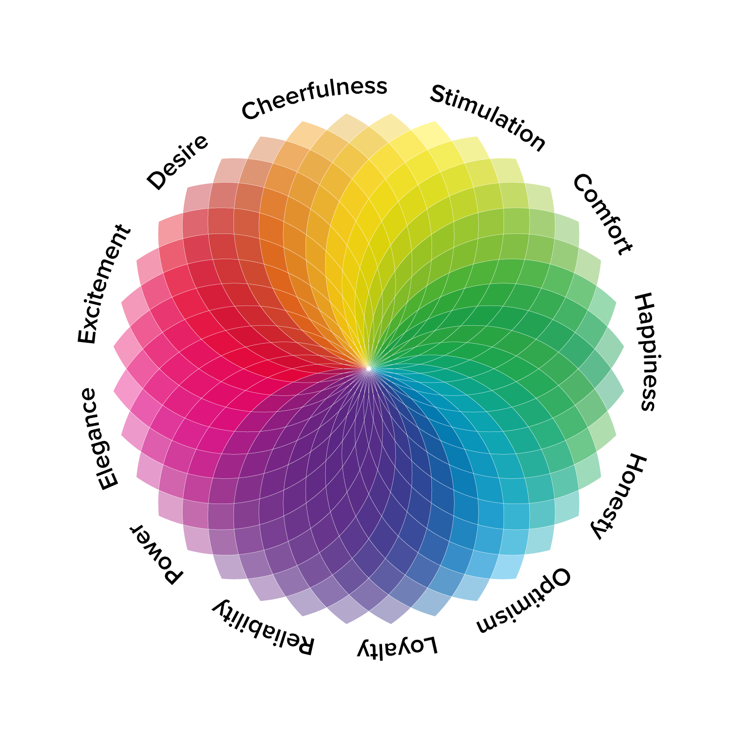
Just as in the physical world, colors in digital also carry symbolic meanings and trigger subconscious associations. Understanding these color associations is essential for UX designers aiming to craft experiences that not only look appealing but also resonate emotionally and guide user behavior effectively.
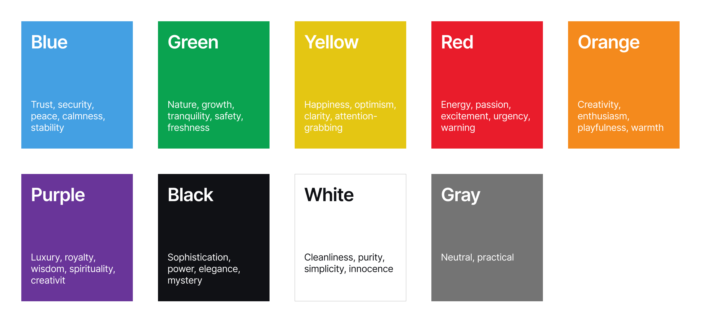
As the EMB Global states, the way we perceive and interpret color is not universal, yet broad patterns of association exist. For instance, the color blue often evokes feelings of trust, stability, and calmness. This association stems from the natural world — the vastness of the sky and the tranquility of deep waters. In the digital space, this makes blue a popular choice for financial institutions, corporate platforms, and interfaces aiming to project reliability and security. However, the specific shade and context matter immensely. A bright, electric blue can feel energetic and modern, while a muted and darker blue might convey a more serious and authoritative tone.
Kendra Cherry, a psychosocial and rehabilitation specialist and author of the book Everything Psychology, explains very well how colors evoke certain responses in us. For example, the color green is intrinsically linked to nature, often bringing about feelings of growth, health, freshness, and tranquility. It can also symbolize prosperity in some cultures. In digital design, green is frequently used for health and wellness applications, environmental initiatives, and platforms emphasizing sustainability. A vibrant lime green can feel energetic and youthful, while a deep forest green can evoke a sense of groundedness and organic quality.
Yellow, the color of sunshine, is generally associated with optimism, happiness, energy, and warmth. It’s attention-grabbing and can create a sense of playfulness. In digital interfaces, yellow is often used for highlighting important information, calls to action (though sparingly, as too much can be overwhelming), or for brands wanting to project a cheerful and approachable image.
Red, a color with strong physiological effects, typically evokes excitement, passion, urgency, and sometimes anger or danger. It commands attention and can stimulate action. Digitally, red is often used for alerts, error messages, sales promotions, or for brands wanting to project a bold and energetic identity. Its intensity requires careful consideration, as overuse can lead to user fatigue or anxiety.
Orange blends the energy of red with the optimism of yellow, often conveying enthusiasm, creativity, and friendliness. It can feel less aggressive than red but still commands attention. In digital design, orange is frequently used for calls to action, highlighting sales or special offers, and for brands aiming to appear approachable and innovative.
Purple has historically been associated with royalty and luxury. It can evoke feelings of creativity, wisdom, and mystery. In digital contexts, purple is often used for brands aiming for a sophisticated or unique feel, particularly in areas like luxury goods, beauty, or spiritual and creative platforms.
Black often signifies sophistication, power, elegance, and sometimes mystery. In digital design, black is frequently used for minimalist interfaces, luxury brands, and for creating strong contrast with lighter elements. The feeling it evokes heavily depends on the surrounding colors and overall design aesthetic.
White is generally associated with purity, cleanliness, simplicity, and neutrality. It provides a sense of spaciousness and allows other colors to stand out. In digital design, white space is a crucial element, and white is often used as a primary background color to create a clean and uncluttered feel.
Gray is often seen as neutral, practical, and sometimes somber or conservative. In digital interfaces, various shades of gray are essential for typography, borders, dividers, and creating visual hierarchy without being overly distracting.
Evoking Emotions In Digital Interfaces
Imagine an elegant furniture application. The designers might choose a primary palette of soft, desaturated blues and greens, accented with gentle earth tones. The muted blues could subtly induce a feeling of calmness and tranquility, aligning with the app’s core purpose of relaxation. The soft greens might evoke a sense of nature and well-being, further reinforcing the theme of peace and mental clarity. The earthy browns could ground the visual experience, creating a feeling of stability and connection to the natural world.
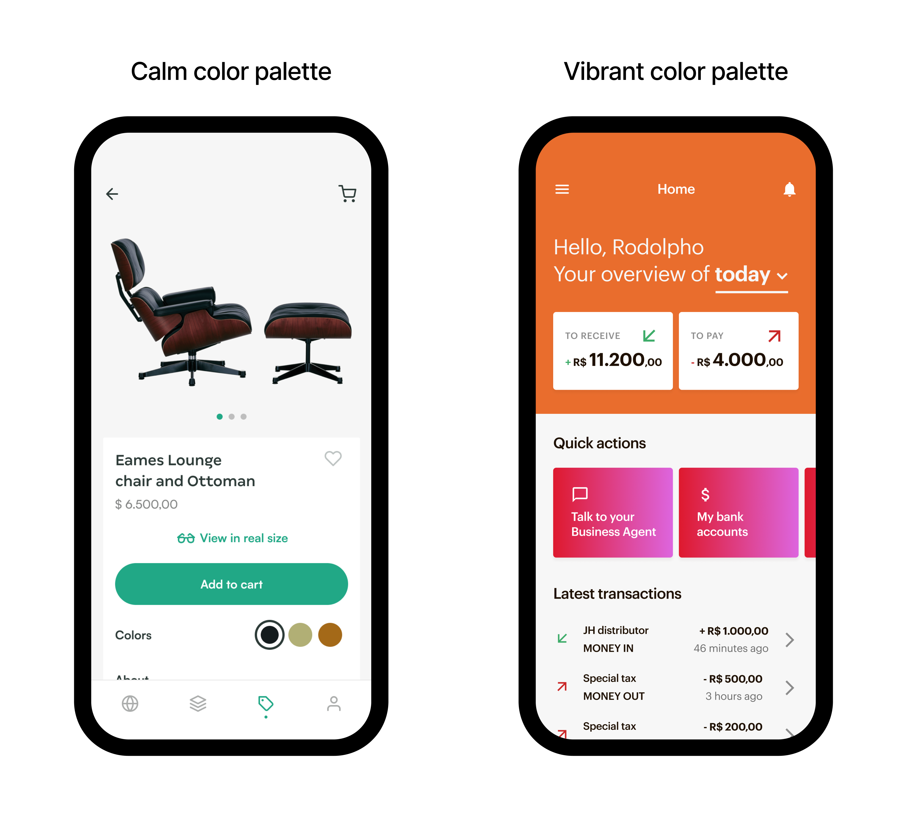
Now, consider a platform for extreme investment enthusiasts. The color palette might be dominated by high-energy oranges and reds, contrasted with stark blacks and sharp whites. The vibrant oranges could evoke feelings of excitement and adventure, while the bold red might amplify the sense of adrenaline and intensity. The black and white could provide a sense of dynamism and modernity, reflecting the fast-paced nature of the activities.
“
Color As A Usability Tool
Choosing the right colors isn’t about adhering to fleeting trends; it’s about ensuring that our mobile applications and websites are usable by the widest possible audience, including individuals with visual impairments. Improper color choices can create significant barriers, rendering content illegible, interactive elements indistinguishable, and ultimately excluding a substantial portion of potential users.
Prioritizing color with accessibility in mind is not just a matter of ethical design; it’s a fundamental aspect of creating inclusive and user-friendly digital experiences that benefit everyone.
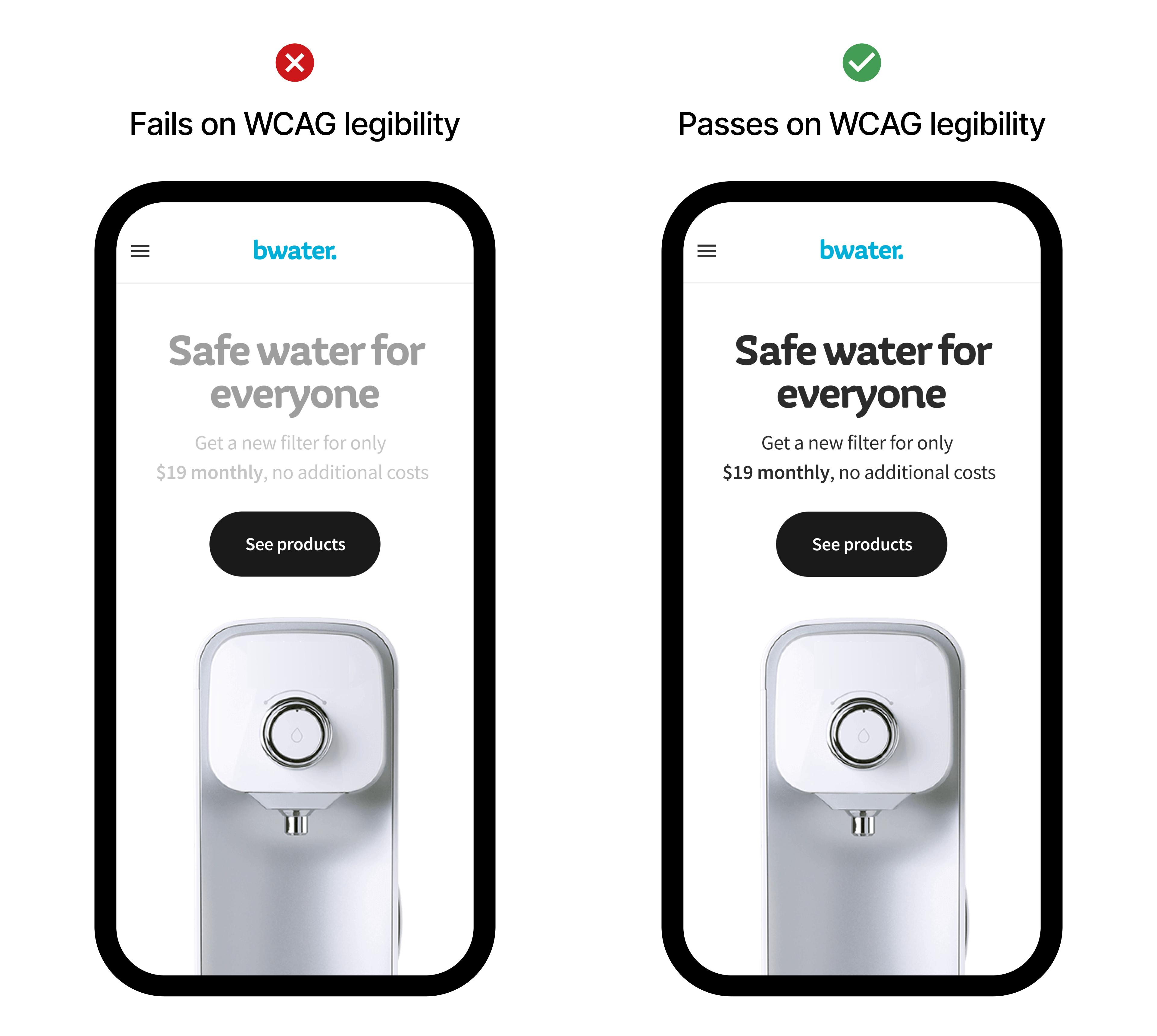
For individuals with low vision, sufficient color contrast between text and background is paramount for readability. Imagine trying to decipher light gray text on a white background — a common design trend that severely hinders those with even mild visual impairments. Adhering to Web Content Accessibility Guidelines (WCAG) contrast ratios ensures that text remains legible and understandable.
Furthermore, color blindness, affecting a significant percentage of the population, necessitates the use of redundant visual cues. Relying solely on color to convey information, such as indicating errors in red without an accompanying text label, excludes colorblind users. By pairing color with text, icons, or patterns, we ensure that critical information is conveyed through multiple sensory channels, making it accessible to all. Thoughtful color selection, therefore, is not an optional add-on but an integral component of designing digital products that are truly usable and equitable.
Choosing Your Palette
As designers, we need a strategic approach to choosing color palettes, considering various factors to build a scalable and impactful color system. Here’s a breakdown of the steps and considerations involved:
1. Deep Dive Into Brand Identity And Main Goals
The journey begins with a thorough understanding of the brand itself. What are its core values? What personality does it project? Is it playful, sophisticated, innovative? Analyze existing brand guidelines (if any), target audience demographics and psychographics, and the overall goals of the digital product. The color palette should be a visual extension of this identity, reinforcing brand recognition and resonating with the intended users. For instance, a financial app aiming for trustworthiness might lean towards blues and greens, while a creative platform could explore more vibrant and unconventional hues.
2. Understand Color Psychology And Cultural Associations
As discussed previously, colors carry inherent psychological and cultural baggage. While these associations are not absolute, they provide a valuable framework for initial exploration. Consider the emotions you want to evoke and research how your target audience might perceive different colors, keeping in mind cultural nuances that can significantly alter interpretations. This step is important to help in making informed decisions that align with the desired user experience and brand perception.
3. Defining The Core Colors
Start by identifying the primary color — the dominant hue that represents your brand’s essence. This will likely be derived from the brand logo or existing visual identity. Next, establish a secondary color or two that complement the primary color and provide visual interest and hierarchy. These secondary colors should work harmoniously with the primary, offering flexibility for different UI elements and interactions.
4. Build A Functional Color System
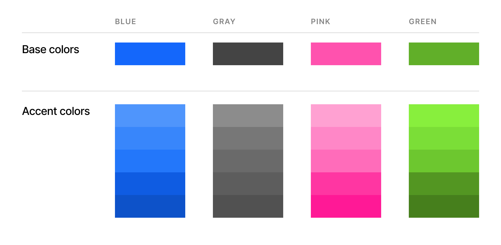
A consistent and scalable color palette goes beyond just a few base colors. It involves creating a system of variations for practical application within the digital interface. This typically includes tints and shades, accent colors, and neutral colors.
5. Do Not Forget About Usability And Accessibility
Ensure sufficient color contrast between text and background, as well as between interactive elements and their surroundings, to meet WCAG guidelines. Tools are readily available to check color contrast ratios.
Test your palette using color blindness simulators to see how it will be perceived by individuals with different types of color vision deficiencies. This helps identify potential issues where information might be lost due to color alone.
Visual hierarchy is also important to guide the user’s eye and establish a clear visual story. Important elements should be visually distinct.
6. Testing And Iteration
Once you have a preliminary color palette, it’s crucial to test it within the context of your digital product. Create mockups and prototypes to see how the colors work together in the actual interface. Gather feedback from stakeholders and, ideally, conduct user testing to identify any usability or aesthetic issues. Be prepared to iterate and refine your palette based on these insights.
A well-defined color palette for the digital medium should be:
- Consistent,
- Scalable,
- Accessible,
- Brand-aligned,
- Emotionally resonant, and
- Functionally effective.
By following these steps and keeping these considerations in mind, designers can craft color palettes that are not just visually appealing but also strategically powerful tools for creating effective and accessible digital experiences.
Color Consistency: Building Trust And Recognition Through A Harmonized Digital Presence
Consistency plays an important role in the whole color ecosystem. By maintaining a unified color scheme for interactive elements, navigation cues, and informational displays, designers create a seamless and predictable user journey, building trust through visual stability.
Color consistency directly contributes to brand recognition in the increasingly crowded digital landscape. Just as a logo or typeface becomes instantly identifiable, a consistent color palette acts as a powerful visual signature. When users repeatedly encounter the same set of colors associated with a particular brand, it strengthens their recall and fosters a stronger brand association. This visual consistency extends beyond the core interface to marketing materials, social media presence, and all digital touchpoints, creating a cohesive and memorable brand experience. By strategically and consistently applying a solid and consistent color palette, digital products can cultivate stronger brand recognition, build user trust, and enhance user loyalty.
 (yk)
(yk)

