Anime vs. Marvel/DC: Designing Digital Products With Emotion In Flow

Email Newsletter
Weekly tips on front-end & UX.
Trusted by 182,000+ folks.


 Register Free Now
 Celebrating 10 million developers
 SurveyJS: White-Label Survey Solution for Your JS App
Design isn’t only pixels and patterns. It’s pacing and feelings, too. Some products feel cinematic as they guide us through uncertainty, relief, confidence, and calm without yanking us around. That’s Emotion in Flow. Others undercut their own moments with a joke in the wrong place, a surprise pop-up, or a jumpy transition. That’s Emotion in Conflict.
These aren’t UX-only ideas. You can see them everywhere in entertainment. And the clearest way to feel the difference is to compare how anime handles emotional shifts versus how Marvel and DC films stumble. We’ll use two specific examples, one from Dan da Dan (anime series on Netflix) and one from James Gunn’s Superman movie, to define the two concepts, and then translate them into practical product design patterns you can apply right away.
Note: We’ll focus on digital products, including apps, SaaS, and web.
Emotion In Flow (Anime: Dan da Dan)
In Dan da Dan, the tonal range is wild, horror, comedy, tenderness, yet it flows.
Example: In one arc, the protagonists are on a bizarre, comedic quest involving the “golden genitals” of one of the main characters (yes, really), and in another, we’re drawn into a heartbreaking story of a mother whose child is kidnapped. On paper, that shift should be a car crash. On screen, it’s coherent and emotionally legible.
Why does this work on screen?
- Continuity of stakes.
Even when a gag lands, the characters’ goals and danger stay intact. Humor releases tension after a mini‑resolution; it doesn’t deny the threat. - Clear mood cues.
Music, framing, pacing, and character reactions telegraph the next feeling. You’re primed for the shift, so you ride it rather than getting yanked. - One emotional anchor.
Relationships remain the North Star, so the scene’s heart doesn’t get lost when the tone moves.
How does this translate to UX?
Good products do the same: prepare, transition, resolve, so users stay immersed as the emotional tone shifts.

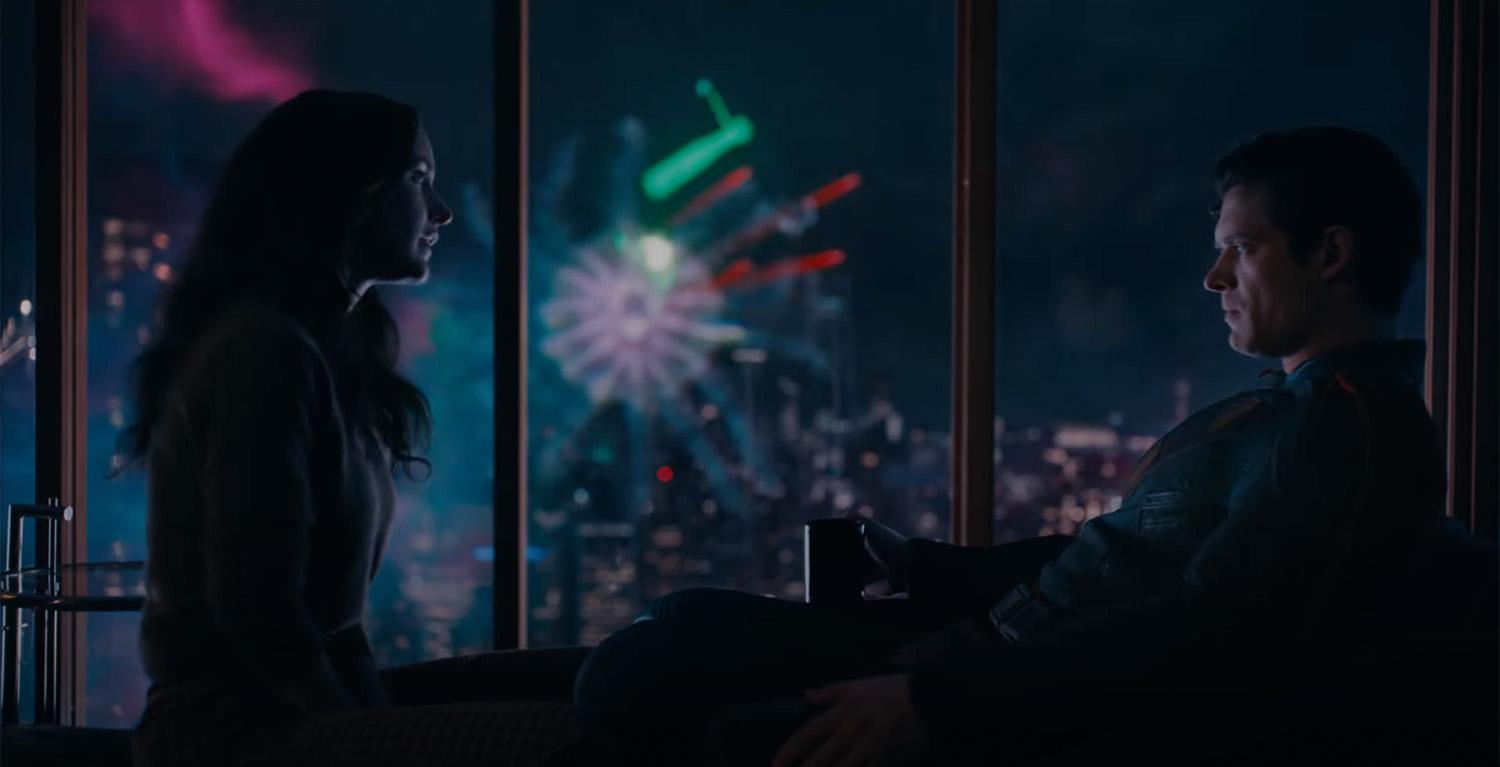
Emotion In Conflict (Marvel/DC: James Gunn’s Superman)
Lois & Clark are having a heartfelt, intimate conversation, a slow, human moment, while in the background a running gag plays out (a monster getting clobbered with a giant baseball bat). The gag steals the focus right when the scene asks you to feel something real. The result is a tonal clash that punctures the emotion instead of releasing it.
Why does this fail on screen?
- Increased cognitive load.
What’s happening here maps directly to cognitive load theory. When a scene (or interface) asks users to process two competing emotional signals at once, it introduces extraneous cognitive load, mental effort that has nothing to do with the task or moment itself. Instead of focusing on the emotional beat, attention is split between signals that don’t resolve each other. In products, this is what happens when humor, promotions, or unexpected UI changes intrude on high-stakes moments: users are forced to interpret tone and intent at the same time they’re trying to act, which slows comprehension and increases stress. - Competing beats at the same time.
The joke overlaps the climax of a serious beat; the audience pays attention to the switch rather than the feeling. - No tonal handoff.
There’s no transition that lands the intimacy before humor arrives, so the moment feels undercut rather than resolved.
How does this translate to UX?
In products, this is the confetti-before-confirmation problem, the cheeky error in a money flow, or the promo modal that appears right in the middle of a critical task. This also spikes cognitive load: users must process the humor while trying to fix a problem, which slows them down and increases stress.
Quick Definitions
Emotion in Flow
Emotional shifts feel earned, telegraphed, and timed so they resolve prior beats. Immersion holds.
Emotion in Conflict
A jarring switch (or hard cut) that punctures a live emotional beat. Immersion breaks.
Now that we’ve named it: how does this connect to UX?
How Emotions Shape Product Memorability
People don’t remember the average of an experience; they remember peaks and the ending. If your flow’s peak is frustration, or your ending is messy, that’s what sticks. So design the emotional curve on purpose.
Emotions live across three layers (from Don Norman’s Emotional Design), and your product needs to line them up:
- Visceral (gut): First-impression signals: visuals, motion, haptics, sound.
Examples: A steady skeleton loader calms more than a jittery spinner; a gentle success chime/haptic tap lets the win land without shouting; consistent easing/direction tells the eye what changed. - Behavioral (doing): Can I complete my task smoothly? Friction here means stress.
Examples: Three clear payment steps with predictable progress; error states that explain what happened and how to recover; inline validation instead of end-of-form explosions. - Reflective (meaning): The story I tell myself after, “Was that worth it? Do I trust this?”
Examples: A tidy wrap-up screen (“Done. You’ll get X by Friday.”) gives closure; a small recap (“You saved €18 this year”) creates pride without fireworks.
Microinteractions are the emotional glue. Each one has a trigger (I tap Pay), rules (what the system does), feedback (progress and a clear result), and loops or modes (what happens if the user tries again). Get these right, and your transitions bridge feelings. Get them wrong, and they break the flow.
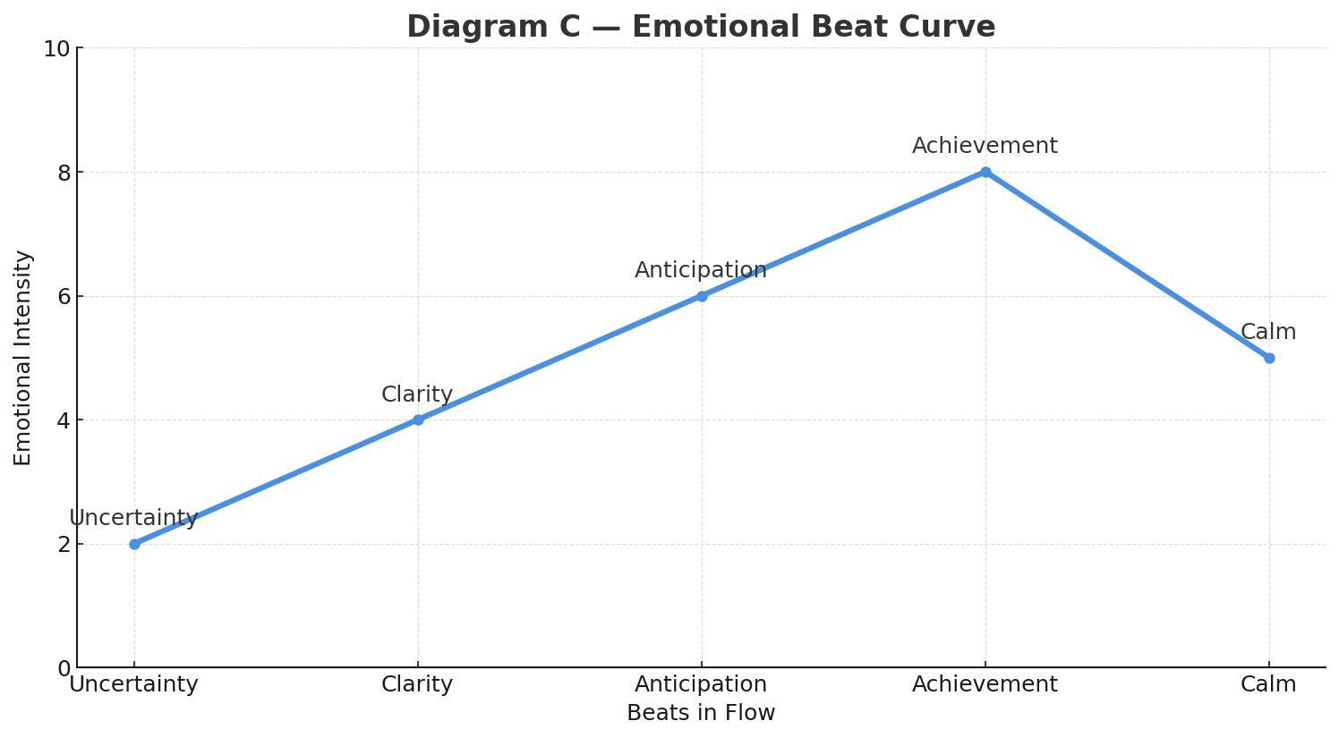
The emotional beat sheet maps cleanly onto Norman’s layers of experience:
- Uncertainty lives in the visceral and early behavioral layers, where users rely on sensory cues (motion, clarity, feedback) to understand what’s happening.
- Clarity is firmly in the behavioral layer, the moment when the system’s intent and the user’s next action lock into place.
- Anticipation is a blend of behavioral (the user is doing something with purpose) and reflective (the user is already predicting the outcome and imagining what comes next).
- Achievement is a reflective peak, where the user evaluates success, trust, and whether the experience “felt right.”
- Calm/Closure is primarily reflective, helping users wrap up the meaning of the interaction and decide if the product is trustworthy and worth returning to.
In real products, this sequence doesn’t disappear when things go wrong. Errors, latency, and degraded states are not exceptions to the emotional arc — they are part of it. Seen through a narrative lens, these moments are the obstacles in the hero’s journey. A well-designed recovery state acknowledges the setback, clarifies what happened, and guides the next step without introducing new emotional noise. When failure is treated as a beat instead of a rupture, emotional flow can be preserved even under stress.
UX Examples: Emotion In Flow vs. Emotion In Conflict
Emotion In Flow
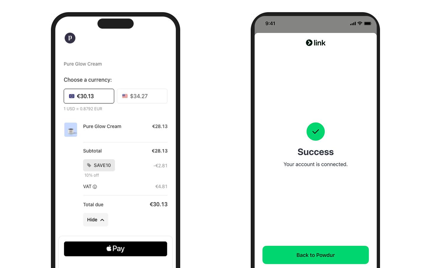
Checkout done right (Stripe/Apple Pay style): short steps, clear progress, and a crisp success state (a checkmark with an optional soft haptic). The peak (success) lands, and the end gives closure (receipt or next step).
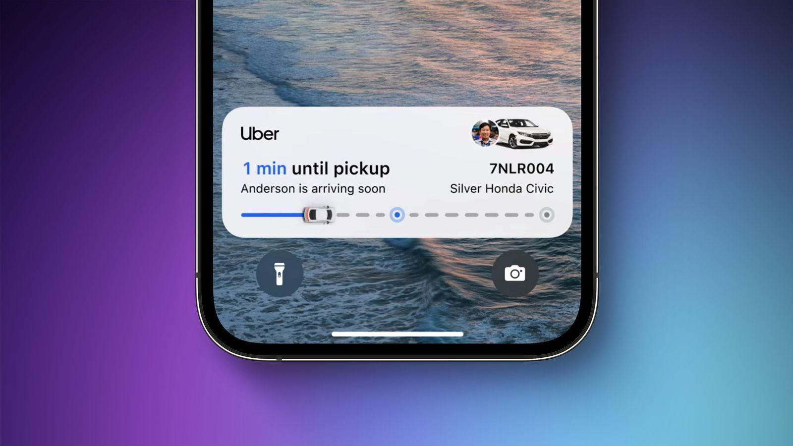
Pickup status (ride‑hailing apps, e.g., Uber, Free Now, or Bolt): progressive updates maintain orientation and reduce anxiety (“Driver arriving”, “2 min away”, “Arrived”). Uncertainty turns into clarity, with gentle motion preparing each transition.
Emotion In Conflict
Note: We’re not naming specific products here — we respect the work behind them. Instead, we’re showing the patterns that cause emotional conflict and exactly how to fix them.
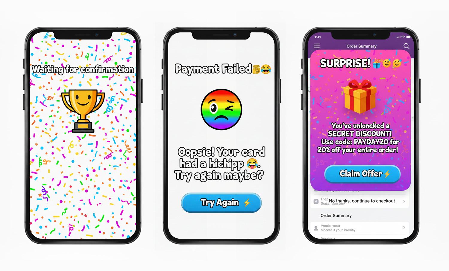
- Jokes in serious moments.
Cheeky copy-in-error states for money/health/security. Users are stressed; humor amplifies irritation. - Celebration before resolution.
Confetti, fireworks, or loud sounds before confirmation. The party interrupts the climax. - Hard state jumps.
Surprise modals/promos mid‑task, full‑screen takeovers without preparation. Feels like an abrupt cut during an emotional beat.
What You Can Do To Ensure Emotion in Flow
Here’s a Notion page with the full template you can duplicate:
1. Write The Emotional Beat Sheet First
For each core flow (onboarding, payment, recovery), map the feelings per step: uncertainty → clarity → anticipation → achievement → calm. Attach copy, motion, and microinteractions to each beat. (Who carries the emotion where?)
2. Align Tone With Task Risk
Create a tone matrix (risk level × state). In high‑risk errors, be calm, plain, and solution‑oriented. Save playfulness for low‑risk contexts.
Template snippets:
- High‑risk error: “We couldn’t verify your ID. Try again or contact support.”
- Low‑risk empty state: “Nothing here yet. Want to start with a sample?”
This is where many mature products quietly drift into emotional conflict. Over time, teams add delight by habit rather than intent.
A useful self-check is to ask: If we removed every playful or celebratory element from this step, would the flow still feel humane — or were those elements masking friction?
“
3. Design Peak And End On Purpose
Engineer one clear peak (the moment of success) and one clean end (confirmation and what happens next). Measure recall and satisfaction at both points.
4. Use Microinteractions As Bridges, Not Spotlights
- Prepare: Small, consistent motion hints before a big state change.
- Confirm: Success gets a subtle settle, with a slightly slower ease-out and an optional light haptic.
- Recover: Repeated failure gracefully shifts tone from upbeat to supportive and guides the next step.
5. Test For Emotional Continuity
In usability sessions, don’t just ask “Was that easy?” Instead, you can ask “What feeling changed here?” If you hear “confused → amused → confused,” you’ve got conflict, not flow. Iterate transitions, not just screens.
How To Avoid Emotion in Conflict: Fast Checklist
Red flags → fixes:
- Jokes in serious moments → swap for calm, direct language, and a clear recovery path.
- Celebration before resolution → move celebration to after confirmation; tone it down for high‑risk tasks.
- Hard state jumps → pre‑announce transitions; keep framing consistent; use meaningful motion to preserve continuity.
- Cross‑team tone drift → centralize voice & tone guidelines with examples per risk level and state.
There are moments when breaking emotional flow is intentional and necessary. Security warnings, legal confirmations, and safety-critical alerts often benefit from abrupt tonal shifts. In these cases, disruption signals importance and demands attention. The problem isn’t emotional conflict itself; it’s accidental conflict. When designers choose disruption deliberately, users understand the stakes instead of feeling whiplash.
Conclusion
Great experiences are directed experiences. Dan da Dan shows how to move through feelings without losing us: it prepares, transitions, and resolves. The Superman scene shows the opposite: a gag colliding with a heartfelt beat.
Do the former. Map your emotional beats, align tone to task risk, and let microinteractions bridge feelings so users remember the right peak and the right end, not the whiplash in the middle.


