
November 1, 2016 Smashing Newsletter: Issue #169
Editorial This newsletter issue was sent out to 196,178 newsletter subscribers on Tuesday, November 1st 2016. If you are not subscribed yet, feel free to subscribe to our email newsletter anytime. Change is coming. Over the last months, we’ve been working on a redesign of our little magazine, spending a lot of time on a new creative direction and rethinking the way to feature articles on the site. Our adventures have led us through trenches and revamps — not to mention countless Slack discussions on the shades of navigation and buttons.

Editorial
This newsletter issue was sent out to 196,178 newsletter subscribers on Tuesday, November 1st 2016. If you are not subscribed yet, feel free to subscribe to our email newsletter anytime.
Change is coming. Over the last months, we’ve been working on a redesign of our little magazine, spending a lot of time on a new creative direction and rethinking the way to feature articles on the site. Our adventures have led us through trenches and revamps — not to mention countless Slack discussions on the shades of navigation and buttons.
Well, the design will be quite different. Yes, we’ve reviewed our priorities. We’ve rediscovered a new typography and a new layout. And yes, we’ve brought focus from advertising to our our lovely Smashing projects, such as our printed books, eBooks, conferences, workshops, as well as the job board. Furthermore, our upcoming Smashing Membership will be packed with some useful, truly smashing, features. We’re very excited about the upcoming changes!
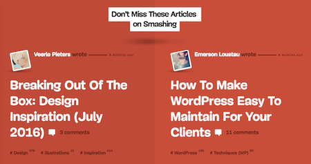
We hope to roll out the new design in early 2017 (fingers crossed!), and as we’re getting close to the finish line, it’s time to open up the design for a new round of usability testing — just to iron out all those little things that often tend to be forgotten or misaligned. We’d love to hear your feedback, and if you have a minute to spare, please sign up for our usability panel, so we can send you an email with a sneak preview (along with a few questions) later this week.
Thanks for staying smashing! We look forward to all your thoughts and feedback, and sincerely appreciate your every bit of your time and support.
— Vitaly (@smashingmag)
1. Speed Up Your Sketch Workflow
Have you heard of Sketch Runner yet? If you’re designing with Sketch, then this little helper is sure to make your workflow a lot smoother. How? Well, it lets you run commands right from the keyboard — no more searching your way through the menu. Yes, it’s that simple.
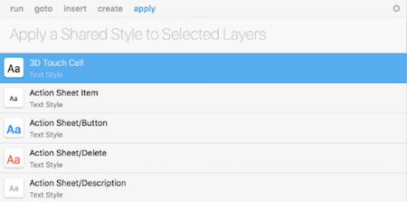
To speed up common tasks, just wake up Sketch Runner and start typing. You can run Sketch menu items and third-party plugin actions directly from the tool or use it to jump anywhere in your document — to any page, artboard, group or layer. It’s also possible to search and insert or replace symbols, create symbols or styles on the fly, and apply styles to layers. Sketch Runner is still in beta but already works with all Sketch versions of 3.7 and newer. A real-time saver! (cm)
2. Free SVG Background Patterns
Now let’s be honest. There can never be enough of background patterns, right? Well, here’s another cool collection of repeatable SVG background patterns for you to use on your digital projects: Hero Patterns. Created by Steve Schoger, a UI designer and illustrator from Kitchener, Ontario, this collection is completely free and is frequently updated.
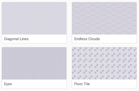
You can browse through the patterns, and use CSS provided to apply the background pattern to your project. There are also appearance settings available which you can adjust as you like, such as the foreground color and opacity, as well as the background color. You can also check out Steve’s Zondicons, a set of free premium SVG icons that were designed from a micro perspective and evaluated at a macro perspective. Cool set! (il)
3. A Chrome Extension To Search For Previously Visited Sites
Falcons are known for their extraordinary vision. They can spot their prey from miles away and dive at a speed of 200 miles per hour to snatch their prey. Given this impressive precision, it’s no wonder that Andrew Ilyas and Logan Engstrom chose the name “Falcon” for their Chrome extension. With the precision of an eagle-eyed bird, Falcon finds text in websites you’ve browsed days, even weeks, ago.
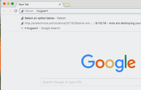
To make it possible, every time you visit a site, Falcon indexes all the text on the page so that it can easily be found later. To search your previously visited sites, just press F, then Space or Tab in the omnibar and enter the keywords you’re looking for. You can also search in a specific time range if you wish. By the way, some domains are automatically blacklisted from indexing (the majority of banking websites, for example), but you can also manage which URLs you don’t want Falcon to index.
On top of that, all information is stored locally — the makers promise that no data will leave your computer. And if you still don’t feel comfortable installing a browser extension from the Chrome Web Store that can read and modify all data on the site you visit, Falcon also supports a transparent installation so you can read through the code and verify that there is nothing malicious. (cm)
4. Pushing Performance For Critical Pages
Not all pages are created equal. What if you were asked to push the performance of a fancy new landing page to the edges to the maximum? Obviously, you’ll do your homework and set up an HTTP/2 server while keeping the files as small as possible. But what if that’s not enough?
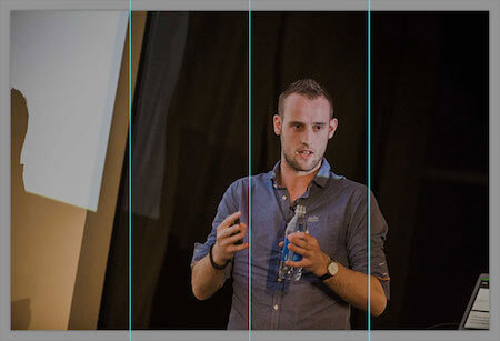
For web fonts, the best we can do is to subset the font to just the Regular glyphs you need on the landing page. You might need bold and italic though. In that case, you could first render the entire page in a subset Regular weight with that small subset font base64 encoded in the header of the page, and then once the page is displayed, load full Regular, Bold and Italic in the second stage.
For JavaScript, load only what’s absolutely critical and everything else asynchronously. For CSS, use resource hints like preload, use progressive loading or loadCSS.
What about images? That product image should be appearing fast after all. Well, use JPEG compressor or PNG Optimizer, but that goes without saying. Look into improving perceived performance with multiple background images and provide a gradient fallback for an image that loosely resembles the original.
That should be enough to keep you going. So, what SpeedIndex score can you hit for your landing page? (vf)
5. Time For A Change: The Paris Metro Map Redesign
A public transportation map is probably one of the most challenging things a designer could possibly design. It means making sense of an abstract maze of lines, stops, and nodes to enable the visitors and residents of a city to find their routes as quickly and pain-free as possible. While all transportation maps look essentially the same at first glance, it’s the small details here that set a good map apart from a brilliant one.
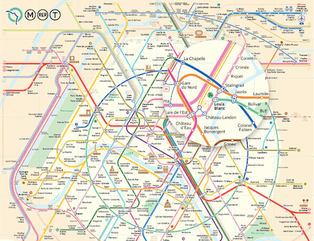
Graphic designer Constantine Konovalov recently presented his redesign of the Paris Metro Map to the public. Two and a half years of work went into developing the fundamentally new design that covers the metro system of the French capital as well as regional trains and trams. While the colors and graphic symbols have stayed the same compared to the map that is currently in use, the real innovation lies in the circular line pattern on which the layout is based. It simplifies the perception of the map as the circles provide visual anchors and divide the map into segments.
To make route finding even faster, Constantine also straightened the lines as much as possible. In fact, his design gets by with two times less line bends as the classical map thanks to a new 30-degree grid that allows to increase the number of converging lines compared to the 45-degree grid which transportation maps typically employ. UX design at its best. (cm)
6. A Movie Poster A Day
Some movie posters are so memorable that you can’t forget them even if you wanted to. Just think of the The Godfather poster with the puppeteer’s hand, Titanic with the ship’s bow and the portrait of the two lovers, or Bill Murray sitting on the edge of a hotel bed wearing a bathrobe for Lost In Translation. Designer Pete Majarich decided to breathe new life into the posters we all know, and embarked on an ambitious 365 days project at the beginning of this year. The aim: To design an alternative movie poster for every day in 2016.
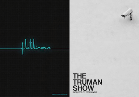
Pete’s take on the posters is a lot more simplistic than the originals. The colors are calm and muted, the plot of the movies boiled down to the core and illustrated with only a few elements. A challenge that certainly isn’t easy to master, yet Pete manages to provide strong alternatives that don’t imitate but rethink their bigger brothers. And with the project already having passed day 300, things are looking quite good that Pete may even reach the 365 landmark. Something to keep an eye on! (cm)
7. Unique Designs For Parks
Ever feel like we should all show more appreciation to the nature around us? Well, Type Hike is a collaborative design project that does just that. Sixty designers and typographers have come together and have promised to create a unique design for a national park within the USA which they’re fond of. A brilliant idea, isn’t it?
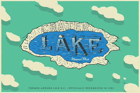
The project is organized by David Rygiol and James Louis Walker, and is a wonderful typographic exploration of America’s National Parks. 52 out of 60 posters have already been submitted, so it’s worth coming back to the site and checking out more designs as they are added until the full set of 60 is complete. Simply inspiring. (il)
Inspiration, Freebies, Misc.
- How To Transform Your Next Conference Takeaways Into Real-Life Results
- WDRL #155: On JSPerf, Client Hints, And Keeping The Balance
- WDRL #156: Browser News, Webpack 2, And Lessons Learned From HPKP
That’s All, Folks!
Thank you so much for reading and for your support in helping us keep the web dev and design community strong with our newsletter. See you next time!
Smashing Newsletter
Useful front-end & UX bits, delivered once a week. Subscribe and get the Smart Interface Design Checklists PDF — in your inbox. 🎁
You can always unsubscribe with just one click.
Previous Issues
- Web Performance 2026
- Designing Surveys
- Accessibility and Inclusive Design
- Interface Design Patterns
- UX Research Strategies and Tools
- Inspiring Little Websites
- State of CSS, UX, JavaScript and AI in 2025
- Product Design & UX
- New CSS Features and Techniques
- Designer’s Guides and Tools
Looking for older issues? Drop us an email and we’ll happily share them with you. Would be quite a hassle searching and clicking through them here anyway.

