
January 24, 2017 Smashing Newsletter: Issue #174
Editorial This newsletter issue was sent out to 234,068 newsletter subscribers on Tuesday, January 24th 2017. If you are not subscribed yet, feel free to subscribe to our email newsletter anytime. The beginning of a new year is usually calm and somewhat unspectacular. Well, not in the Smashing Universe. From the very first days of January, we’ve been working on the final, finishing touches to our upcoming redesign. Still, we aren’t quite there yet.

Editorial
This newsletter issue was sent out to 234,068 newsletter subscribers on Tuesday, January 24th 2017. If you are not subscribed yet, feel free to subscribe to our email newsletter anytime.
The beginning of a new year is usually calm and somewhat unspectacular. Well, not in the Smashing Universe. From the very first days of January, we've been working on the final, finishing touches to our upcoming redesign. Still, we aren’t quite there yet. Usability matters, and so we go through iterations of design and user feedback to get everything right.
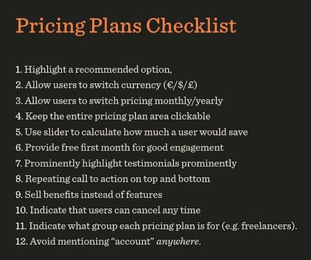
Especially with the upcoming Smashing Membership, we want to set up a package that you’ll find useful and relevant — with a price accessible to everybody. On our way there, we’ve rediscovered a few things that potentially make any eCommerce experience better. As one of the results, we’ve set up a Pricing Plans Design Checklist, with 22 things you might want to keep in mind when designing pricing pages (also available as a public gist). A write-up on our learnings will be coming up after Smashing Magazine’s website relaunch.
We’re expecting to start with a slow roll-out of the public beta version by early February, and maybe alongside the launch of SmashingConf NYC 2017 tickets sale (Jan 31, 10 A.M. EST). Still, please sign up for Usability Testing Panel if you have a couple of mins to spare — we’d love to get your constructive feedback!
Thanks, and stay tuned!
— Vitaly (@smashingmag)
1. The Beauty Of Simplicity
Sometimes we need some fresh visual inspiration to fuel our ideas. The next time you find yourself craving for some, be sure to stop by at Search System. The tumblog is full of design goodness that shines with simplicity and reminds us that sometimes less is more.
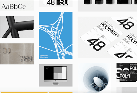
What you’ll get is a potpourri of stellar product, identity and print design, but also architecture. Whether it’s something mundane such as the sole of a shoe, a toothbrush, or an alkaline battery, or even something as sophisticated as the interior design of an art gallery, Search System doesn’t make a difference. Whatever combines beauty and simplicity can be found over there. Truly refreshing for the eyes and the mind. (cm)
2. A Sneak-Peek At The New Smashing Magazine Redesign
You’ve already heard: Smashing Magazine will look quite different soon (redesign alert!). The starting point for the redesign was kicked off by Andrew Clarke, while Daniel Mall took a more bold and playful twist on the design direction. Eventually, Sara Soueidan joined in as a front-end dev and both Sara and Marko Dugonjić helped refine the existing direction of the design. Ricardo Gimenes created lovely illustrations to breathe some wit into the design (watch out for cats!).
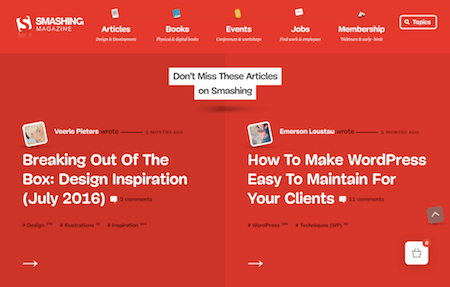
While Sara announced to write about the techniques she used in more detail in a separate row of articles, her case study shares her role in the process and how her vision to better reflect the idea of Smashing Magazine was put into practice, i.e. “a magazine by the community, for the community.” You can gain insights into the nitty gritty details, too, of course, especially in which Sara talks about her favorite thing to design, and handling the tricky task to master navigation. A tasty appetizer for what’s to come. Watch out for February! (cm)
3. Movie Poster Design At Its Best
You’re a film fan? Great, then you’ll love this find. And even if you’re not that much into movies, we’re almost certain that you’ll enjoy it, too: Movie Poster Of The Day. The showcase presents a new movie poster each day, but not such much the ones that are part of collective memory, it’s rather about the unusual finds — things like a Danish Citizen Kane Poster from 1946, for example. An inspiring and surprising stroll through movie poster design from all over the world and through all decades.
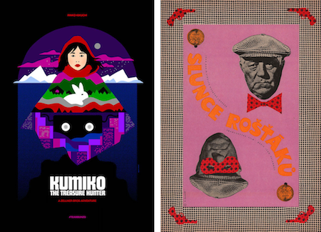
Speaking of movie posters, 2016 was a good year, too. Adrian Curry, design director at Zeitgeist Films, recently shared his top ten posters from smaller, independent films that were released last year. Films that took a lot more creative risk in designing their posters as their big budget counterparts. Courage that has paid off. (cm)
4. Fighting For The Users
UX designers do outstanding work to craft the best experiences for their users. It’s a craft that requires experience, empathy, and the will to adapt to an ever-evolving tech landscape. However, if you’re just about to get started in the field, all of this can feel quite daunting. So why not learn from the pros and find out how to better stand up for your users?
With the podcast User Defenders, Jason Ogle attempts to offer just what you need to stay inspired and enlightened on your UX journey: a look into the mind of leading UX practitioners. What makes them tick? What’s their secret to success? There are already 31 episodes available in which experts such as Jeffrey Zeldman, Mat Marquis, Aaron Gustafson, Chris Coyier and Aarron Walter talk about empathy, creativity, design thinking and all other things that help you get better and smarter at what you do. Inspiring! (cm)
5. Creating Color Palettes The Easy Way
“Color is an underrated design tool. When used correctly, it can make a website sing.” To help you accomplish just that, Color Supply set out to make your color choices easier — by providing an intuitive color picker. The idea is simple yet genius: You pick a main color from a color wheel, and the tool suggests combinations based on that in different tints and shades. For more influence over the result, you decide whether you want the color scheme to be complementary, analogous, triadic, split-complementary or made up of colors that are positioned on the wheel in a square shape.
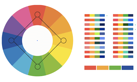
Finally, to see the color scheme in action, the tool provides a preview of the colors applied to a set of icons as well as of how gradients made up of the scheme will look like. If you like what you see, just copy/paste the hex values and use them in your project right away. By the way, some of the color combinations were put together by selected designers and illustrators that have a knack for making up combinations that work well together. (cm)
6. A Small Plugin For Image Zoom Experiences
Images enhance stories, and when it comes to presenting them in the proper light, Medium’s intelligent zoom experience is a stellar example. You’ve probably noticed the subtle zoom action on Medium before: Clicking on an image, will start a seamless animation into a full-screen view; to dismiss the image zoom, you only need to click anywhere or just scroll away. A solution that just feels natural. And, well, good news: A little JavaScript plugin, namely Zoom.js, makes it an easy undertaking to recreate the effect on your own site.
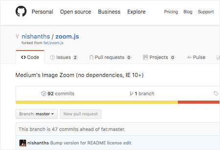
To make it work, you can use Zoom.js directly as a script &mdahs; just link the JS and CSS files to your site and add a data-action=“zoom” attribute to the images you want to make zoomable. That’s already it. Installation via npm is possible, too, by the way. Zoom.js gets by without jQuery or Bootstrap dependencies and works in modern browsers (IE10+). (cm)
7. A Curated List Of Creative Front-End Case Studies
Who doesn’t love to sneak a peek behind the curtains to see how fellow developers tackle a project? How they solve problems? What techniques they used to bring their ideas to life and what lessons they learned along the way? Luigi De Rosa, senior front-end developer at digital agency Epic, does. He loves reading technical case studies and, thus, started to curate “Awesome Case-Study”, a GitHub repository in which he shares case studies that are worth a read.

Luigi already collected more than 30 case studies on a variety of creative front-end development topics that give insights into building interactive experiences, WebGL experiments, Virtual Reality stories, and much more. If you have something to add to the list, don’t hesitate to create a pull request. (cm)
8. A Simple Pie Chart In SVG
Creating a pie chart with web technologies only is a quite daunting challenge that either requires mathematical skills or a library. David Gilbertson now proves that it’s possible without neither of both. Well, not exactly without any maths at all, but without the need to complicatedly juggle with radii, π, sin, cos, and tan all the time.
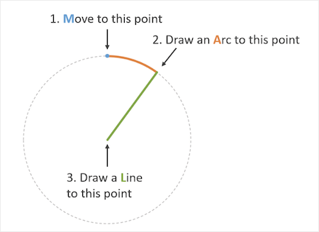
After a lot of tinkering, David came up with a solution that fits his needs: a simple pie chart that is scalable thanks to SVG. And, well, it’s extendable, too — without a lot of extra efforts you can adjust it so that it also shows tooltips or responds to a click or hover event. Clever! (cm)
Inspiration, Freebies, Misc.
- Web Development Reading List #166: Efficient Docker, CSP Learnings, And JavaScript’s Global Object
- Web Development Reading List #165: Starting The New Year With Browser News, Container Architecture, And React “Aha” Moments
- Freebie: Clothing Icons (40 Icons, 9 Styles, AI, EPS, SVG, PNG)
That’s All, Folks!
Thank you so much for reading and for your support in helping us keep the web dev and design community strong with our newsletter. See you next time!
Smashing Newsletter
Useful front-end & UX bits, delivered once a week. Subscribe and get the Smart Interface Design Checklists PDF — in your inbox. 🎁
You can always unsubscribe with just one click.
Previous Issues
- Web Performance 2026
- Designing Surveys
- Accessibility and Inclusive Design
- Interface Design Patterns
- UX Research Strategies and Tools
- Inspiring Little Websites
- State of CSS, UX, JavaScript and AI in 2025
- Product Design & UX
- New CSS Features and Techniques
- Designer’s Guides and Tools
Looking for older issues? Drop us an email and we’ll happily share them with you. Would be quite a hassle searching and clicking through them here anyway.

