July 18, 2017 Smashing Newsletter: Issue #185
This newsletter issue was sent out to 227,600 newsletter subscribers on Tuesday, July 4th 2017.

Editorial
When we think about style guides, we usually think about front-end style guides. Sidebar on the left, with all the patterns grouped and categorized, and components on the right, grouped into families, named and thoroughly documented. In fact, Walmart Style Guide is just one of the examples of how to get it right. We can only imagine how much time and hard work went into crafting it.
But what if we think beyond front-end components alone? There must be a good reason for everybody — literally everybody — in the team to use the web style guide. For example, if designers don’t see how the style guide is relevant for their work (after all, they have their own Sketch master files!), it will only remain relevant to a very limited scope of the team — mainly front-end developers.
For designers, seeing isolated front-end components is useful as a reference, but you can’t start designing without knowing the context of how exactly a given component is used across the range of product’s interfaces. As a result, major design decisions would be made outside of the style guide. Why? “Reusable components can be used in many different but similar ways. Seeing the component a lot leaves room for interpretation. This opens up the door for all kinds of disjointed experiences and makes the system harder to maintain.”
That’s why connecting the components by tagging them and providing actual interface examples can be useful. Audi’s new style guide, for example, contains a set of examples for each component in use. AirBnB’s air/shots is a powerful search engine for design flows and components: You can choose components, languages and the preview format and size.
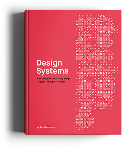
To find a strategy for keeping a design system maintainable on the long term, we’ve teamed up with Alla Kholmatova, previously a lead designer at FutureLearn, to work on the upcoming Design Systems book. In the book, Alla provides a practical guide for effective design systems that empower teams to create great digital products. The book isn’t ready just yet, but you can pre-order and start reading it already. Jump to table of contents. We hope you’ll find it as useful as much as we do.
Happy reading!
Vitaly (@smashingmag)
Table of Contents
- How Would You Design For… Voice?
- Spectral: A Free Google Font For Distraction-Free Reading
- Automated Browser Testing As Easy As It Can Get
- How To Build Better Sliders
- Which UX Tool Suits Your Needs?
- Proofreading Marks For Designers
- Who’s Chirping?
1. How Would You Design For… Voice?
With Amazon’s Alexa, Google Home and Microsoft’s Invoke, the virtual assistant has become reality. But what does designing for voice really mean for designers? What challenges does it all bring along? And how can we tackle them? Amazon provides some valuable tips as well as a guiding thread to base your voice design process on.

The process that Amazon suggests can be divided into four steps: First, determine what people want to accomplish. Then write scripts to show the conversation between the user and the AI and expand it to prepare for things you weren’t expecting — users may say too little, or too much, for example. Finally, once you have your script and flow in place, it’s time to create the structure of what your voice experience should be able to do and what users will say to engage with it. Valuable insights into a new domain. (cm)
2. Spectral: A Free Google Font For Distraction-Free Reading
Have you already seen the newest addition to Google’s font library? It’s called Spectral and was commissioned by Google as a font that works especially well for long, distraction-free reads on screen.
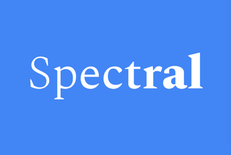
Designed by Parisian-based digital type design agency Production Type, the serif typeface fellow shines with its simplicity. Its functional yet elegant look makes it a perfect fit if you want to add some personality to your documents without going too far. Spectral comes in seven weights of roman and italic and supports more than 120 languages. You can download it for free from Google’s font repository. (cm)
3. Automated Browser Testing As Easy As It Can Get
Starting and running a functional web test with just one command line? Well, TestCafe makes it possible. The tool uses Node.js to provide an end-to-end solution for testing web apps. And the best: It takes care of all stages — from starting browsers to running tests, gathering test results, and generating reports. No browser plugins are needed, the goodness works in all popular modern browsers right out of the box.
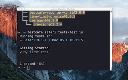
Once the test is done, TestCafe collects the test results from different browsers in one comprehensive report for you. You can use TestCafe with tests written both in JavaScript (latest features such as async/await are supported) as well as TypeScript. Promising! (cm)
4. How To Build Better Sliders
A slider seems like a simple thing to build, but as Ilya Birman claims, for many web developers it’s very difficult to get it right. Why? Well, you need to carefully consider Fitt’s Law to provide decent, continuous feedback. To improve the slider experience, Ilya provides a comprehensive example, in which he shows step by step how to fix the things that usually go wrong.
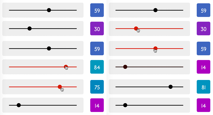
Now what does it look like, a well-built slider? Well, it lets users grab the handle from any point in the slider, without any tedious fiddling around. Also important: The slider should move continuously as you move the mouse, and everything should stay in sync — hover effects, the cursor shape, actual active areas, reaction to click and drag, feedback inside and outside the slider. If you follow this advice, you’ll end up with a shiny, snappy UI control. (cm)
5. Which UX Tool Suits Your Needs?
The number of tools available for designing UX is huge, and even if you have your favorites already, it can’t hurt to compare. Uxtools.co provides a useful overview of tools for UX designers — from Adobe’s suite to Sketch, UXPin, Figma, Affinity Designer, Axure, Atomic.io, and many more.
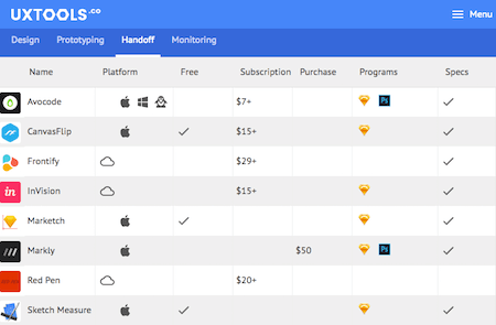
The comparison differentiates between design, prototyping, handoff, and monitoring tools, and compares their pricing, whether they work offline, collaboration and sharing options and other characteristics, so you can quickly assess which tool fits your needs best. Handy! (cm)
6. Proofreading Marks For Designers
“Proofreading marks” might not sound like the most thrilling topic to wrap your head around, but knowing at least the basics of them can never hurt. Who knows, maybe someday you might get a text back from a client, supplied with those weird marks, swirls and abbrevations that most of us don’t have a clue what they mean?
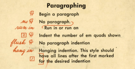
To have the essentials always at your fingertips (just in case, you know), Graham Smith shows us some proofreading marks that could come in handy for designers — think marks to highlight issues with position, margin, alignment, or indention, for example. A throw-back in time, but also a great reminder that a shared set of tools can prevent misunderstandings and make communication a lot more efficient. (cm)
7. Who’s Chirping?
Do you live in the city surrounded by constant noise or do the sounds of nature get through to you? The chirping of the birds in the morning? Their songs at dusk? A blackbird maybe, a titmouse or a little sparrow? Bird sounds vary a lot — some flying fellows produce complex melodies while others chirp their way around. A fascinating AI experiment now attempts to visualize these differences by using machine learning to organize thousands of bird sounds.
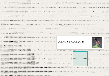
What makes the project so interesting (apart from the fact that it is simply lovely) is that the computer wasn’t given any tags or the bird’s name to handle the task, only the audio. Based on that, it created the map, placing similar sounds closer together. If you want to learn more about the technique behind the experiment, be sure to also check out the accompanying repository on GitHub. (cm)
Smashing Newsletter
Useful front-end & UX bits, delivered once a week. Subscribe and get the Smart Interface Design Checklists PDF — in your inbox. 🎁
You can always unsubscribe with just one click.
Previous Issues
- Web Performance 2026
- Designing Surveys
- Accessibility and Inclusive Design
- Interface Design Patterns
- UX Research Strategies and Tools
- Inspiring Little Websites
- State of CSS, UX, JavaScript and AI in 2025
- Product Design & UX
- New CSS Features and Techniques
- Designer’s Guides and Tools
Looking for older issues? Drop us an email and we’ll happily share them with you. Would be quite a hassle searching and clicking through them here anyway.


