August 1, 2017 Smashing Newsletter: Issue #186
This newsletter issue was sent out to 227,520 newsletter subscribers on Tuesday, July 18th 2017.

Editorial
How would you design a perfect slider control? Not an image gallery slider, or the infamous carousel, but rather one of those tricky price range sliders, timeline sliders or mortgage calculator sliders? Too often they are just a bit too difficult to use. Require just a bit too much precision. A bit too difficult to grab and move.

So, where do you start? First, if you have only a few input options, using a slider probably would be an overkill. Perhaps a set of radio buttons, checkboxes or buttons with pre-defined values might work better instead. A slider is definitely a good option to consider when the user’s input is supposed to encourage exploration rather than precision. To be effective though, sliders need space — the track should be wide and tall enough, and a thumb large enough, and padding for both of them generous enough.
It’s critical to ensure that everything stays in sync as slider is being used: the cursor shape, :hover, :focus and :active states, the position of the handle, reaction to click and drag, the change in values, the change of the states inside and outside of the slider area, response to keyboard controls. The feedback should always be smooth and continuous, without a noticeable lag. Finally, a good slider allows for precision if needed, so extending it by turning the chosen value into a plain input field is usually a good idea.
That’s just a quick preview of what’s expecting you tomorrow: just in case it slipped through your fingers, we’ve started a new series of articles on Smashing Magazine, highlighting all the fine microscopic details on designing perfect UI components. After a closer look at perfect accordions and perfect date and time pickers, tomorrow we’ll be looking into many, many fine examples of perfect slider controls. Hopefully that’s something that will bring some ideas to your toolbox!
Happy reading!
Vitaly (@smashingmag)
Table of Contents
- Plant Trees When You ‘Google’
- Three Months Left: Are You Ready For SmashingConf Barcelona?
- A Collection Of JavaScript Helpers
- Pixel-Perfect Layouts In iOS
- The Power Of Symbols In Sketch
- Drop-Downs As The UI Of Last Resort
1. Plant Trees When You ‘Google’
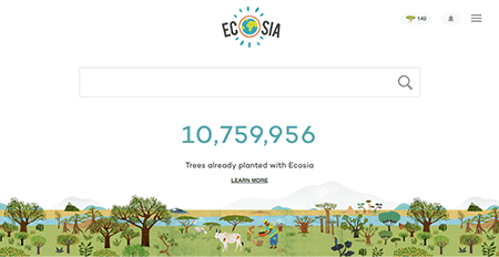
How many times a day do you Google something? Too often to count, right? Now imagine that every time you search for something online, your search helps to plant a tree. Well, that’s no utopian dream, but reality — thanks to the search engine Ecosia.
The way it works is actually quite simple: You do your online search via Ecosia, Ecosia gets revenues from ads, and uses them to plant tress. On average, it takes about 45 searches to plant a tree, and until today more than 10,000,000 trees could be planted this way. Monthly financial reports and insights into the reforestation projects that Ecosia supports, make the undertaking transparent. Definitely worth supporting! So why not give it a try and make Ecosia your default search engine to help reach their ambitious goal: a billion new trees until 2020. (cm)
2. Three Months Left: Are You Ready For SmashingConf Barcelona?
The web is constantly changing. So, where can you get the grips for design systems and how to optimize your websites’ performance? At SmashingConf Barcelona, for sure! On October 17th and 18th, we’ll be returning to the magical Palau de la Música Catalana with two packed days of hands-on sessions by some of the most respected members of our industry.
The focus of the conference will be on Design Systems, SVG techniques, performance, accessibility, and user experience, as well as some useful takeaways for those running their own small studio. Tickets are available now. We’d love to meet you there! (cm)
3. A Collection Of JavaScript Helpers
With so many boilerplates, frameworks, and libraries, it’s hard to keep track of which one fits best to a project. To help us stay on top of things, Chencheng collected a lot of those handy browser-side libraries, resources, and other things in one handy list: the Awesome JavaScript list.
It features everything from bundlers, to testing frameworks, error detection tools, templating engines, UI modules, boilerplates, and a lot more. If you know of a resource that is missing in the collection, feel free to contribute it. (cm)
4. Pixel-Perfect Layouts In iOS
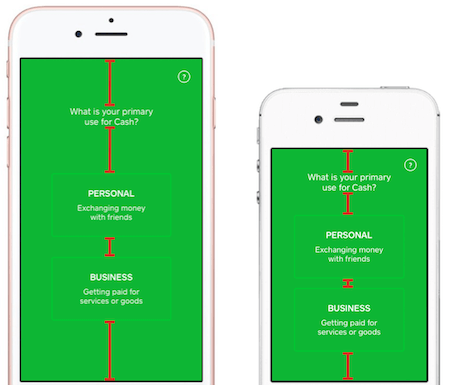
The iOS design mock-up comes in, polished and perfect, and now you have to implement the UI in the best way possible. While you already may be cringing at the thought, we’ve got good news to reduce the headache: meet Paralayout, an open-source toolset that might just become your new best friend.
The tool is basically a set of à la carte utilities, which extends UILabel to provide custom “compact” line wrapping that eliminates the need for manual typesetting. With a single line of code, the toolset can porportionally distribute empty space between titles and buttons. It can also visually balance out any text and space provided, and takes good care of pixel-level rounding. You can read more about it on GitHub. (il)
5. The Power Of Symbols In Sketch
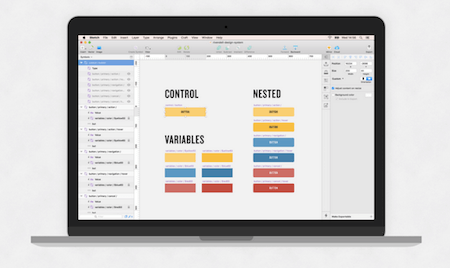
Organization is key, right? This holds true for almost everything in life, including getting work done on time. If you work a lot with Sketch, you’re probably relieved and grateful for the many ways to keep your work organized. As a matter of fact, as Andrew Couldwell puts it, all it takes are a few control symbols to help you build a UI in no time.
Symbols are one of the best methods in Sketch that can help you save time. All you’ll only ever need to add are a few control symbols to an artboard, and quickly switch between all component types and states. There’s even a free Sketch file which you can download at the end of the article, so you can get started right away. Handy! (il)
6. Drop-Downs As The UI Of Last Resort
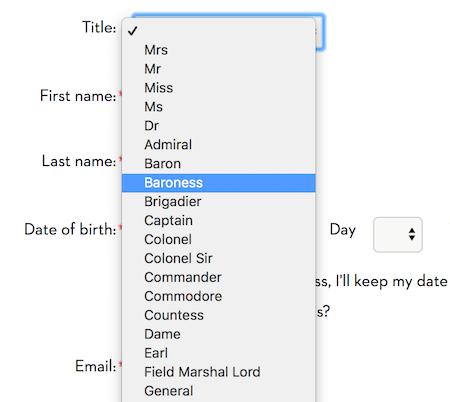
Should drop-down be the UI of last resort? In many ways, yes. A drop-down might seem like an obvious enough pattern: we tap on an icon, get a list of options, choose an option, done. However, a set of radio buttons or buttons would work better if there are only few options available. Longer drop-downs, such as a country selector can be a nightmare to scan through, especially on mobile where keyboard search is usually not available.
And then there are phone drop-downs, birthday drop-downs, salutation drop-downs — all cases where a regular text input or a set of buttons might be a better alternative. A drop-down makes sense with plenty of available options, but it has to be complimented with an autosuggest filter as well. In his article, Dropdown alternatives for better (mobile) forms, Zoltan Kollin highlights some of the common issues and solutions for better data input. Good suggestions which will make you reconsider using that fancy drop-down in your interface or not. (vf)
Smashing Newsletter
Useful front-end & UX bits, delivered once a week. Subscribe and get the Smart Interface Design Checklists PDF — in your inbox. 🎁
You can always unsubscribe with just one click.
Previous Issues
- Web Performance 2026
- Designing Surveys
- Accessibility and Inclusive Design
- Interface Design Patterns
- UX Research Strategies and Tools
- Inspiring Little Websites
- State of CSS, UX, JavaScript and AI in 2025
- Product Design & UX
- New CSS Features and Techniques
- Designer’s Guides and Tools
Looking for older issues? Drop us an email and we’ll happily share them with you. Would be quite a hassle searching and clicking through them here anyway.

